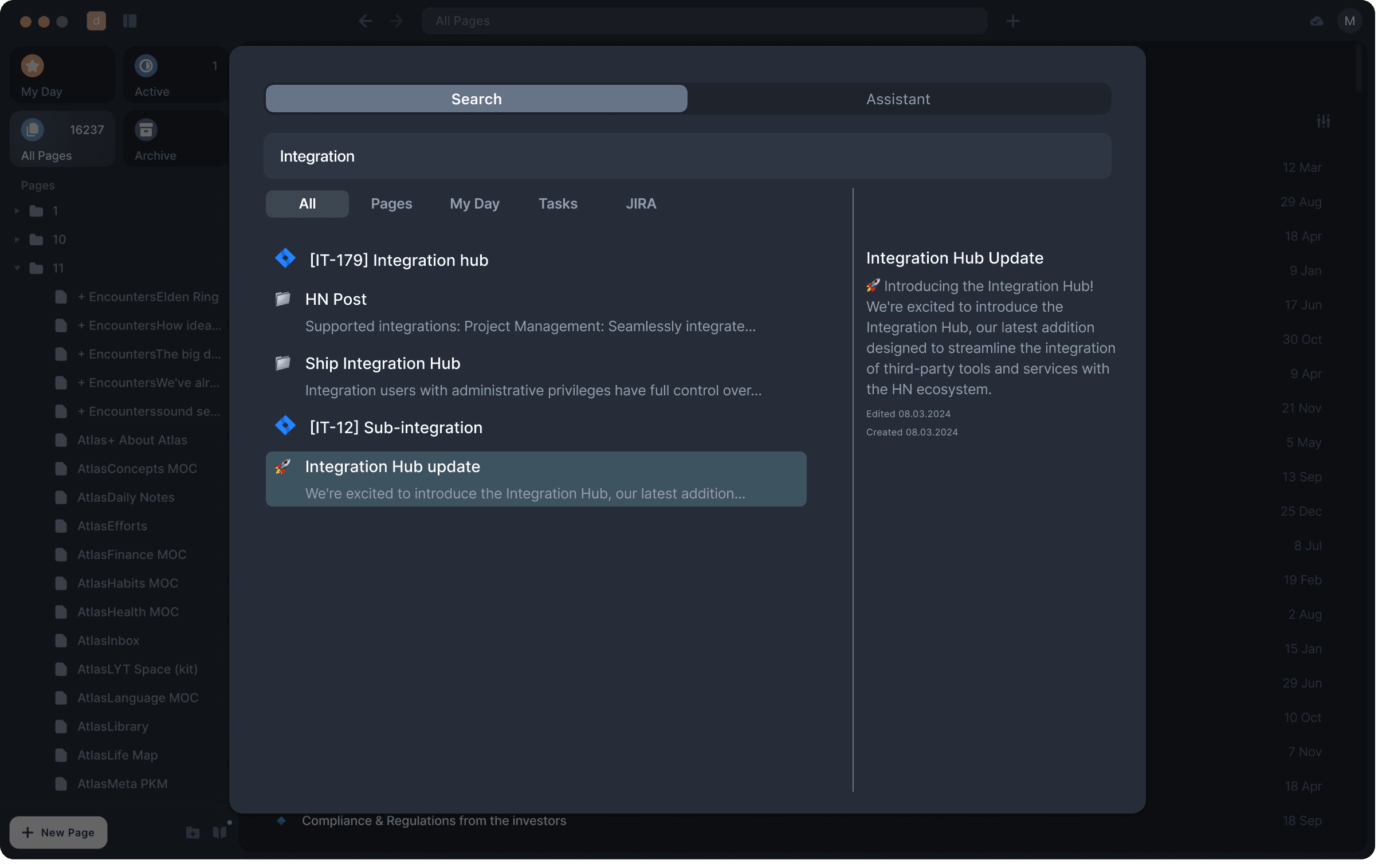
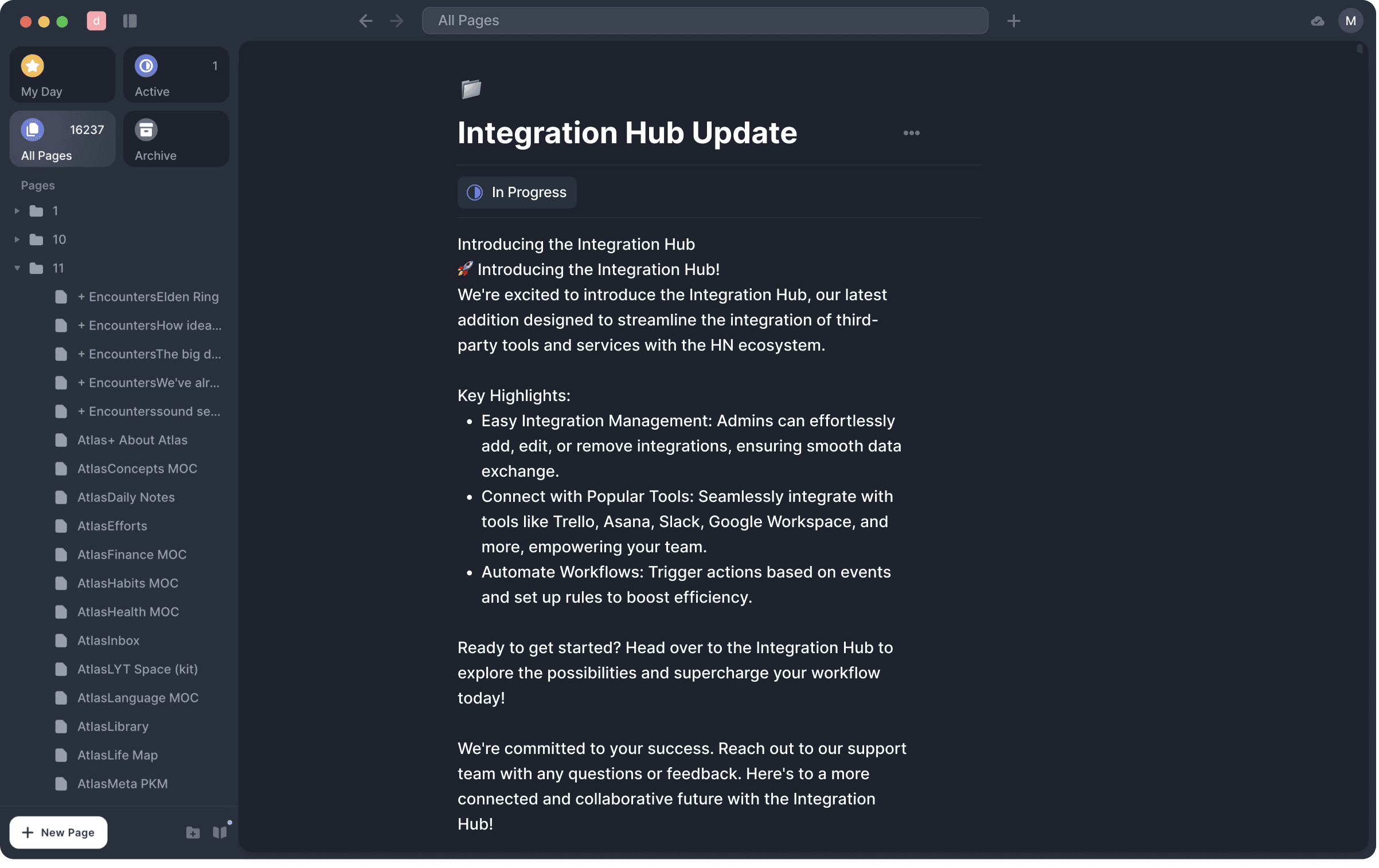
Exploring the Full Search feature at acreom
Exploring the Full Search feature at acreom

acreom is a personal actionable knowledge base operating on markdown pages.
Check out more here 🌐
I spent three months deep diving into the product and this study was a big part of it. The study was aimed at tackling the feedback from an unhappy user.
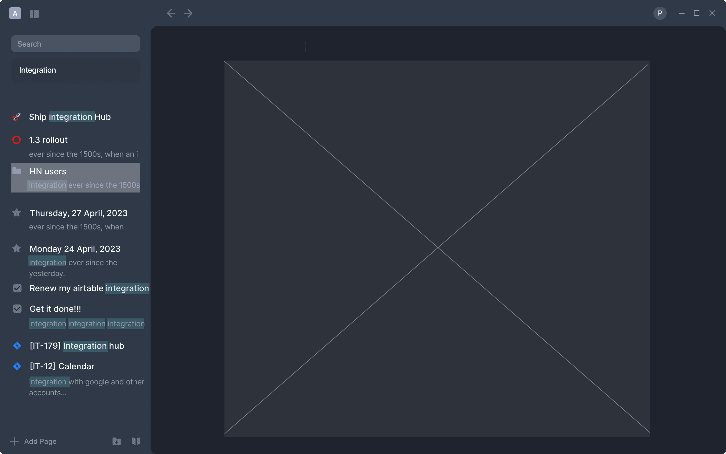
The issue is the following - the Full Search feature is hidden away from the user's eyes and, once found, the presented search results don't provide enough information to feel confident when going to the needed page.
Role
Role
User Research
User Research
Product Strategy
Product Strategy
UI Design
UI Design
Interaction Design
Interaction Design
Usability Testing
Usability Testing
Tools
Tools
Zoom
Zoom
Figma
Figma
Chat GPT
Chat GPT
Figjam
Figjam
Timeline
Timeline
4 weeks
4 weeks
Platform
Platform
Desktop app
Desktop app
The Process
The Process
The Process
Diving my head first into the startup, I still tried to follow the ideal Design process that works best for me (I do like structure after all). With keeping it in mind that we need to push out more options in a shorter timeframe - our process looked more like below (back and forth x100).
Diving my head first into the startup, I still tried to follow the ideal Design process that works best for me (I do like structure after all). With keeping it in mind that we need to push out more options in a shorter timeframe - our process looked more like below (back and forth x100).
Diving my head first into the startup, I still tried to follow the ideal Design process that works best for me (I do like structure after all). With keeping it in mind that we need to push out more options in a shorter timeframe - our process looked more like below (back and forth x100).


DISCOVER
User Feedback | Exploration
DISCOVER
User Feedback | Exploration
DISCOVER
User Feedback | Exploration
acreom largely operates on the feedback from the Discord community. Saying that, I mean that we take users' feedback on the app and turn it into the exploration, before actually committing to implement it.
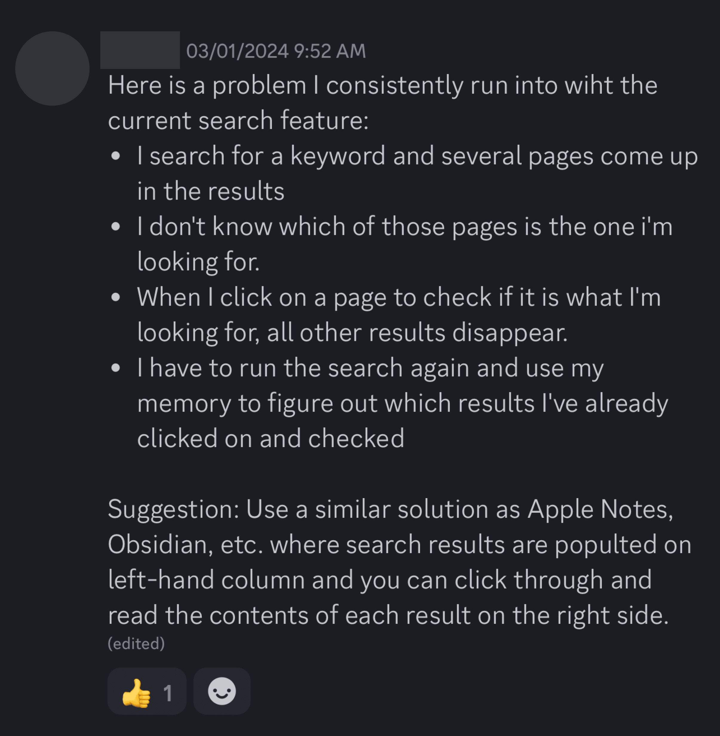
After going through the Feedback channel, one particular stood out to me (check below). Since it was quite explicit and didn't require technical solution from the get go - it was the chosen one.


DISCOVER
User Feedback | Interview
DISCOVER
User Feedback | Interview
DISCOVER
User Feedback | Interview
This comment speaks for itself so, if lazy - one could just work with this. However, we decided to follow up with the user and find out more details on the experience.
Here are the questions we asked ↓
This comment speaks for itself so, if lazy - one could just work with this. However, we decided to follow up with the user and find out more details on the experience.
Here are the questions we asked ↓
This comment speaks for itself so, if lazy - one could just work with this. However, we decided to follow up with the user and find out more details on the experience.
Here are the questions we asked ↓
Do you rely on other apps after facing such an issue?
Why exactly is this an issue for you?
What is usually the information/entry you are looking for?
What is the information that would give you a summary good enough to find the exact information you are searching for?
Do you rely on other apps after facing such an issue?
Why exactly is this an issue for you?
What is usually the information/entry you are looking for?
What is the information that would give you a summary good enough to find the exact information you are searching for?
Do you rely on other apps after facing such an issue?
Why exactly is this an issue for you?
What is usually the information/entry you are looking for?
What is the information that would give you a summary good enough to find the exact information you are searching for?
DISCOVER
User Feedback | Aftermath
DISCOVER
User Feedback | Aftermath
DISCOVER
User Feedback | Aftermath
After having a follow-up discussion with the above-mentioned user, we gathered even more insights than we initially expected. Here's the breakdown on what we learned ↓
After having a follow-up discussion with the above-mentioned user, we gathered even more insights than we initially expected. Here's the breakdown on what we learned ↓
After having a follow-up discussion with the above-mentioned user, we gathered even more insights than we initially expected. Here's the breakdown on what we learned ↓
Search results don’t stay opened after viewing one of them;
Not enough information on the snippet presented;
Having to re-input the search query during the process is quite annoying.
Search results don’t stay opened after viewing one of them;
Not enough information on the snippet presented;
Having to re-input the search query during the process is quite annoying.
Search results don’t stay opened after viewing one of them;
Not enough information on the snippet presented;
Having to re-input the search query during the process is quite annoying.
DEFINE
Jobs to be done
DEFINE
Jobs to be done
DEFINE
Jobs to be done
After writing down all the insights, we decided to put them together into Jobs to be done and also share it with the team for the feedback:
Improved Search
We want to improve the search experience, so that when users are looking at their results, they can quickly navigate between them. We also want them to see multiple results at glance, so they can quickly choose the desired one.
High-level job:
As a developer, I want to find a specific page from all the content within the Vault so that I can recall my knowledge.
Smaller jobs:
As a developer, when I Search within the product, I want to see if multiple keywords match on pages so I can identify the information on the page
The user wants to get through multiple results before they decide this is the result they are looking for.
Current pain points
Not enough information on the snippet presented;
Almost no visual differentiation of matched keyword
How do I know where the highlighted word is ?
Having to re-input the search query during the process;
Frustration when having to search for the exact thing again;
When I open one note and then click on the arrow to go back, it doesn’t open the search results as I would imagine - but puts me to the previously opened note;
Having to remember what has the user checked/not checked before, not to reopen the same page again.
DEFINE
Problem Space
DEFINE
Problem Space
DEFINE
Problem Space
To round up the problem statement, we combined numerous pain points into one concise comment ↓
To round up the problem statement, we combined numerous pain points into one concise comment ↓
To round up the problem statement, we combined numerous pain points into one concise comment ↓
As a user when I have too many results I can’t go to full search straight away. Additionally, there’s not enough information on the snippet presented and I also need to re-input my search query every time.
As a user when I have too many results I can’t go to full search straight away. Additionally, there’s not enough information on the snippet presented and I also need to re-input my search query every time.
As a user when I have too many results I can’t go to full search straight away. Additionally, there’s not enough information on the snippet presented and I also need to re-input my search query every time.
IDEATE
aka Brain Dump
IDEATE
aka Brain Dump
IDEATE
aka Brain Dump
New problems + short timeframe = writing down all your thoughts before actually committing to sketching them out.
Check out the below to see my trains of thoughts ↓
Instead of creating a prototype with a completely new layout, I actually think it makes sense to introduce ideation for some tweaks to the current one:
Get rid of the huge whitespace on the sides, it seems like it’s using unnecessary space without any purpose;
Have a cursor actually change its state to show the users that the item is clickable - simple yet positive impact on the mental level;
When the user has lots of data, quick search is quite long - you cannot even get to the full search because you don’t know it’s there -> makes sense to bring it somewhere else, with a fixed position and not after all the quick search results which might be confusing;
Add a button to give feedback, specific to the Search feature insight the app. It might redirect the user to the same email, or there could be a quick form that will automatically send an email to our feedback address;
Still, the preview would be quite a good addition to the search and we don’t have to incorporate it into the full page or not a full page. We can incorporate a sneak peek into the window by moving the content.
IDEATE
Solution
IDEATE
Solution
IDEATE
Solution
Call it everything - everywhere - all at once (A24 movie name), we were very optimistic about it!
Here're all the things we decided to incorporate into the solution.
SEARCH MODAL:
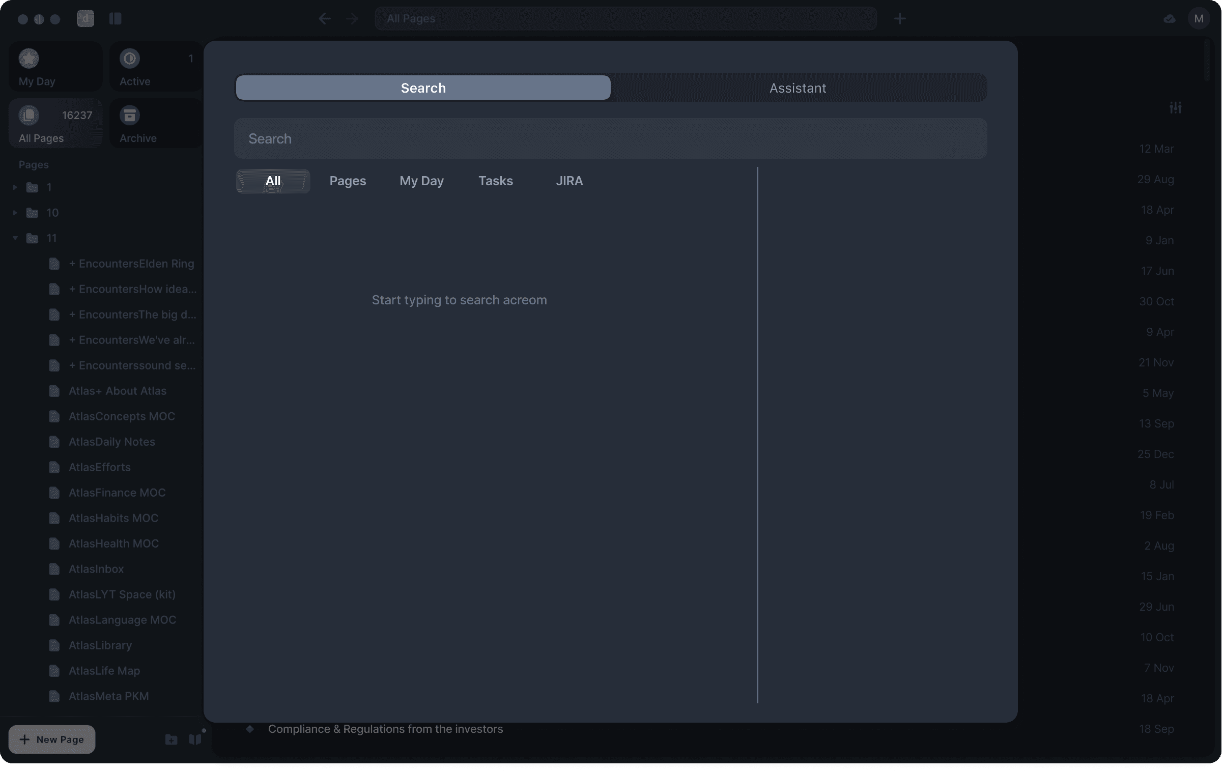
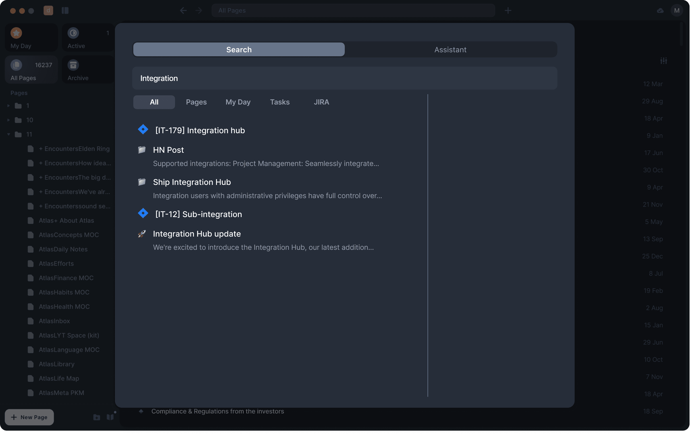
Move the Full Search button to a fixed position;
Two options explored (sneak peek into the next phase) ↓
Call it everything - everywhere - all at once (A24 movie name), we were very optimistic about it!
Here're all the things we decided to incorporate into the solution.
SEARCH MODAL:
Move the Full Search button to a fixed position;
Two options explored (sneak peek into the next phase) ↓
Call it everything - everywhere - all at once (A24 movie name), we were very optimistic about it!
Here're all the things we decided to incorporate into the solution.
SEARCH MODAL:
Move the Full Search button to a fixed position;
Two options explored (sneak peek into the next phase) ↓
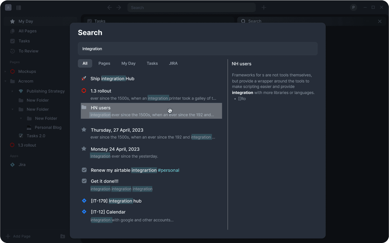
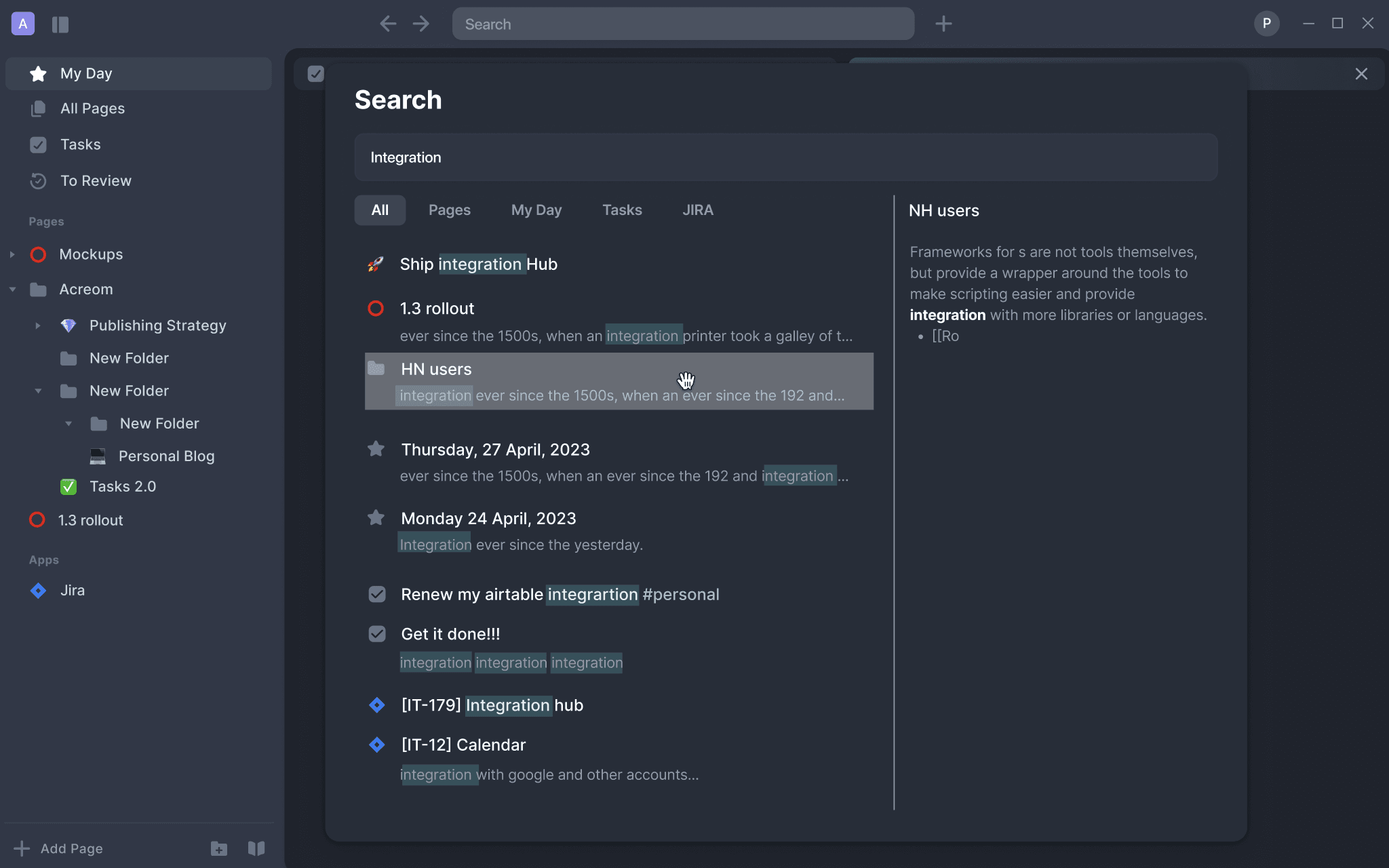
FULL SEARCH MODAL:
Get rid of the whitespaces;
Split the view into two and introduced the preview on the right;
Make a Search bar wider for less awkward positioning;
Make highlights brighter for a better visibility.
FULL SEARCH MODAL:
Get rid of the whitespaces;
Split the view into two and introduced the preview on the right;
Make a Search bar wider for less awkward positioning;
Make highlights brighter for a better visibility.
DESIGN
Colours
DESIGN
Colours
DESIGN
Colours
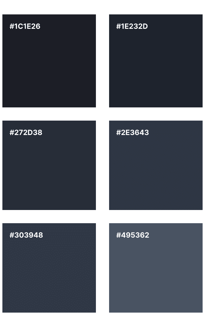
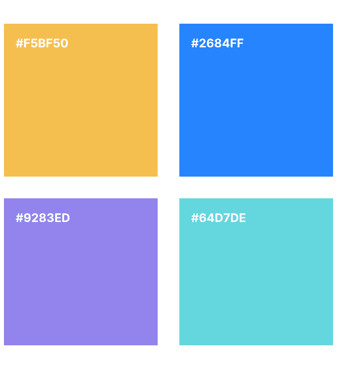
Acreom has the design system established so I was working accordingly. I'm not able to share the system in full, however, I can give you a small peek of its colours.
Acreom has the design system established so I was working accordingly. I'm not able to share the system in full, however, I can give you a small peek of its colours.
Acreom has the design system established so I was working accordingly. I'm not able to share the system in full, however, I can give you a small peek of its colours.
CORE COLOURS
CORE COLOURS
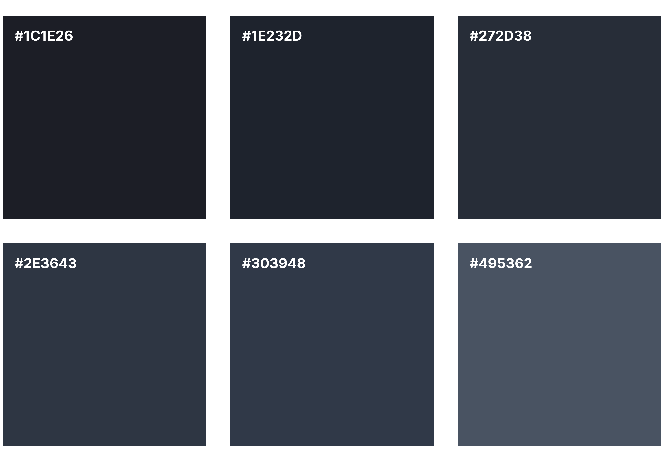

ACCENT COLOURS
ACCENT COLOURS


DESIGN
Components
DESIGN
Components
DESIGN
Components
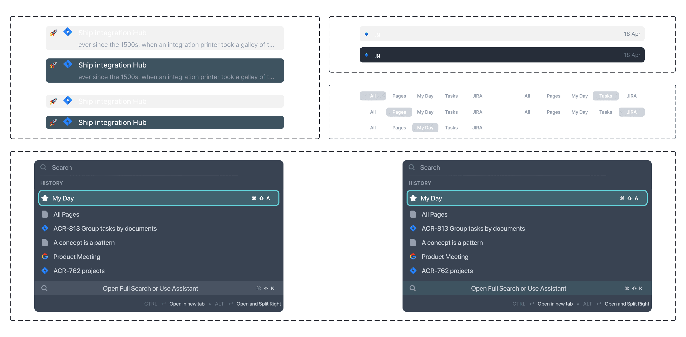
As with the Design system, most of the core components for the screens were already in place. Despite that, I still found a space for me to create a couple new ones, at least to use in this exploration.
As with the Design system, most of the core components for the screens were already in place. Despite that, I still found a space for me to create a couple new ones, at least to use in this exploration.
As with the Design system, most of the core components for the screens were already in place. Despite that, I still found a space for me to create a couple new ones, at least to use in this exploration.


DESIGN
Wireframes | Low-Fidelity & High-Fidelity
DESIGN
Wireframes | Low-Fidelity & High-Fidelity
DESIGN
Wireframes | Low-Fidelity & High-Fidelity
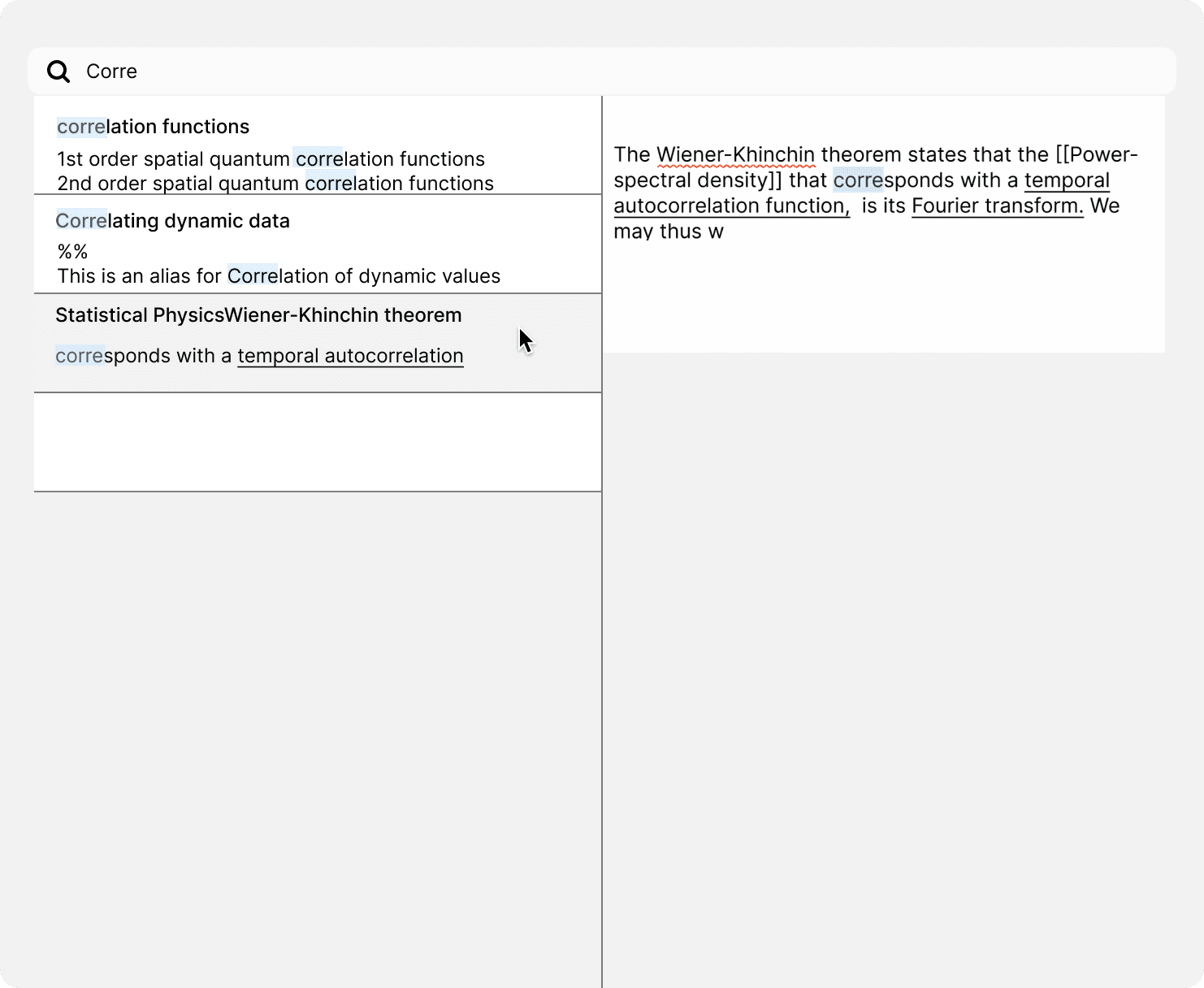
As mentioned before, I had a shortened version of the process so there was just one singular Low-Fidelity wireframe. Check it out below.
As mentioned before, I had a shortened version of the process so there was just one singular Low-Fidelity wireframe.
Check it out below.
As mentioned before, I had a shortened version of the process so there was just one singular Low-Fidelity wireframe. Check it out below.


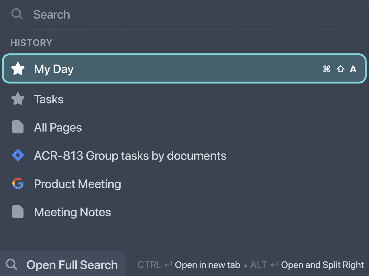
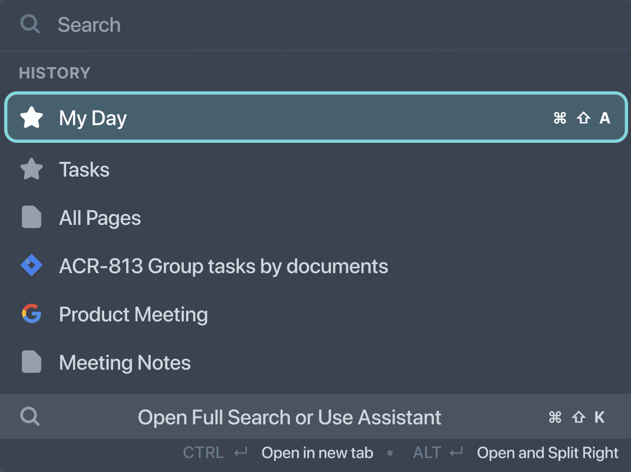
Now it was a completely different story with High-Fidelity wireframes.
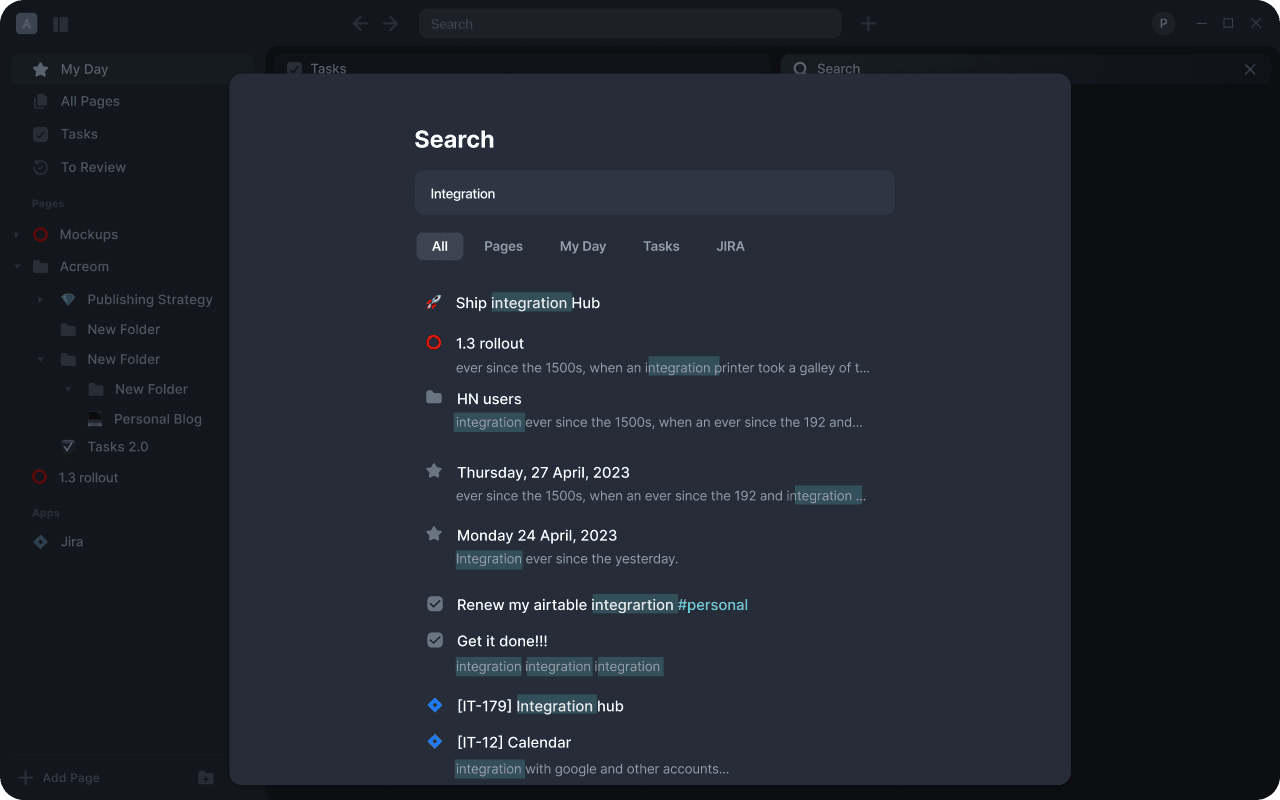
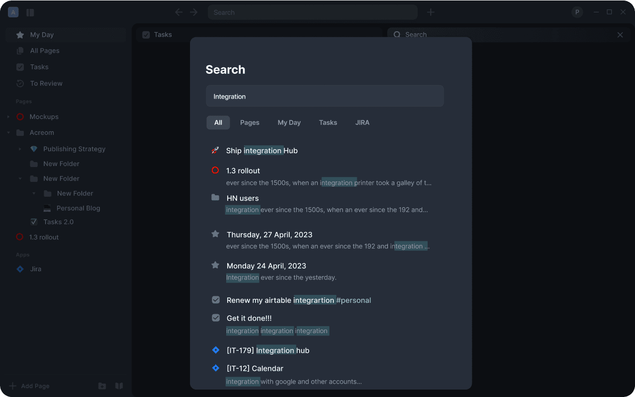
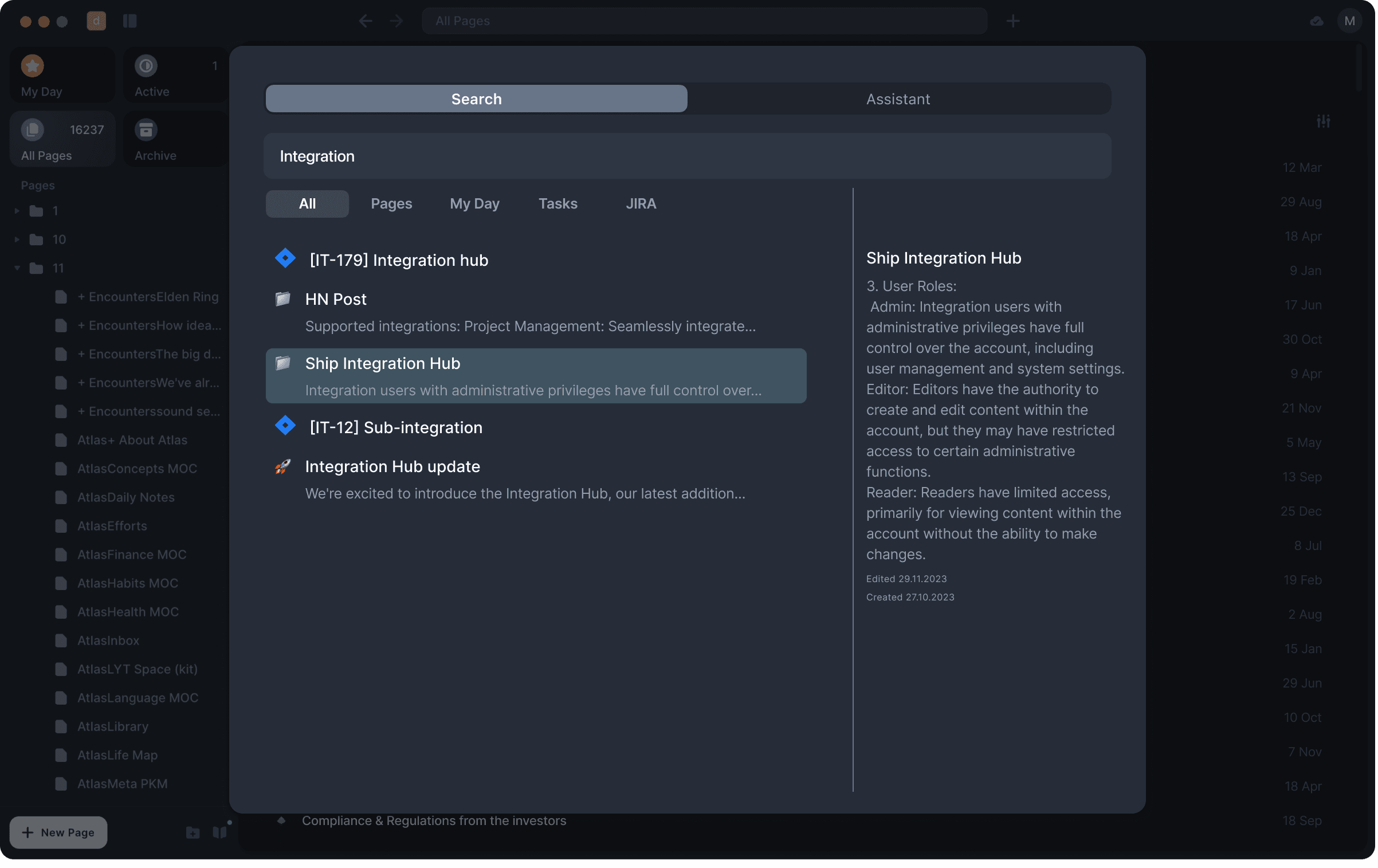
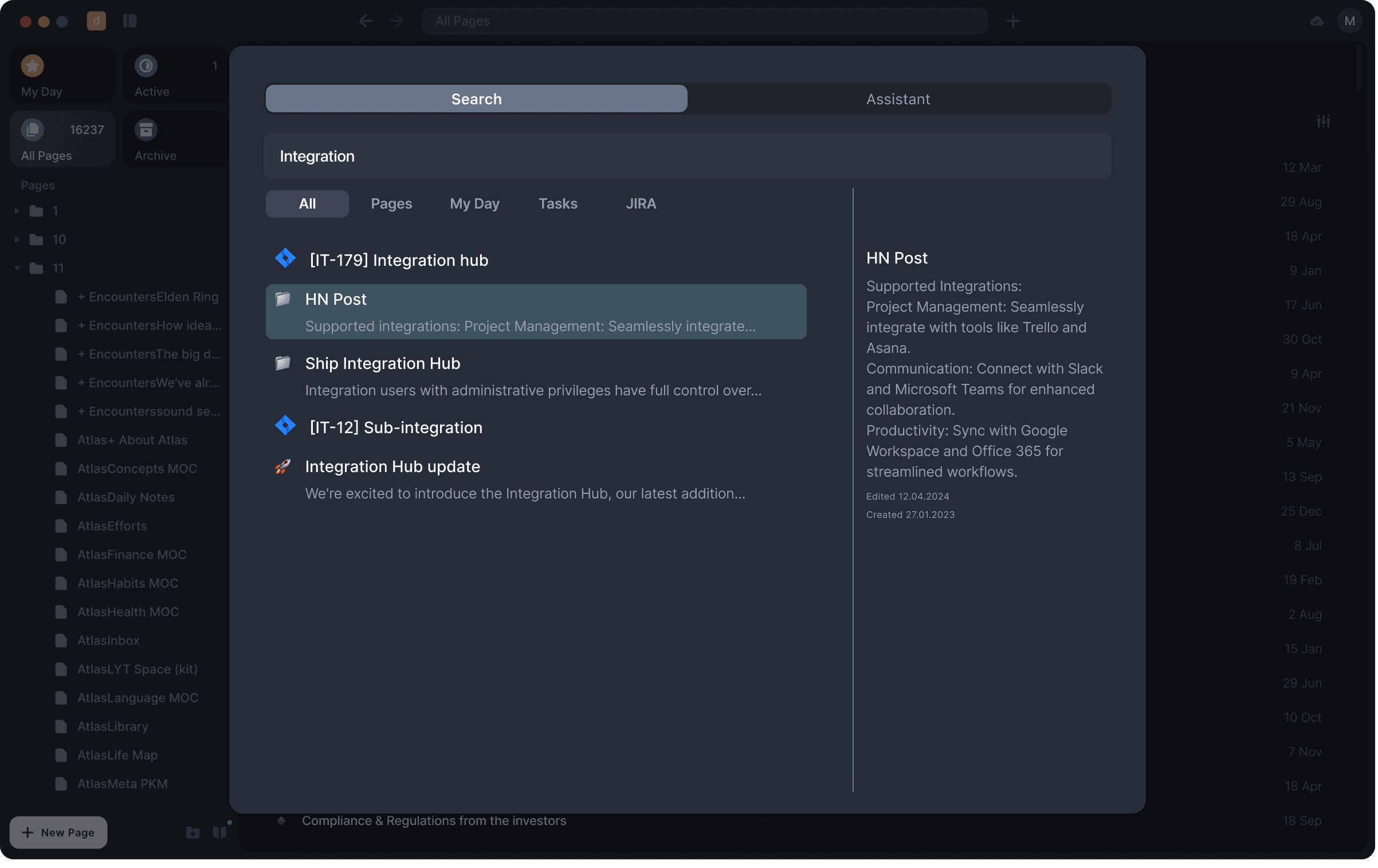
First, there were several versions of wireframes for the presentation of the search results ↓
Now it was a completely different story with High-Fidelity wireframes.
First, there were several versions of wireframes for the presentation of the search results ↓
Second, the layout ↓
Second, the layout ↓
Lastly, the position of the Full Search button ↓
Lastly, the position of the Full Search button ↓
Now it was a completely different story with High-Fidelity wireframes.
First, there were several versions of wireframes for the presentation of the search results ↓
Second, the layout ↓
Lastly, the position of the Full Search button ↓


DESIGN
High-Fidelity Prototype
DESIGN
High-Fidelity Prototype
DESIGN
High-Fidelity Prototype
Compared to my bootcamp projects, to put together this high-fidelity prototype, I had to think of the scenario we are testing first. There were several points to consider: starting point, end point, and clear goal for the User; all that was tied with validating questions.
Compared to my bootcamp projects, to put together this high-fidelity prototype, I had to think of the scenario we are testing first. There were several points to consider: starting point, end point, and clear goal for the User; all that was tied with validating questions.
Compared to my bootcamp projects, to put together this high-fidelity prototype, I had to think of the scenario we are testing first. There were several points to consider: starting point, end point, and clear goal for the User; all that was tied with validating questions.
Here is the breakdown of the above:
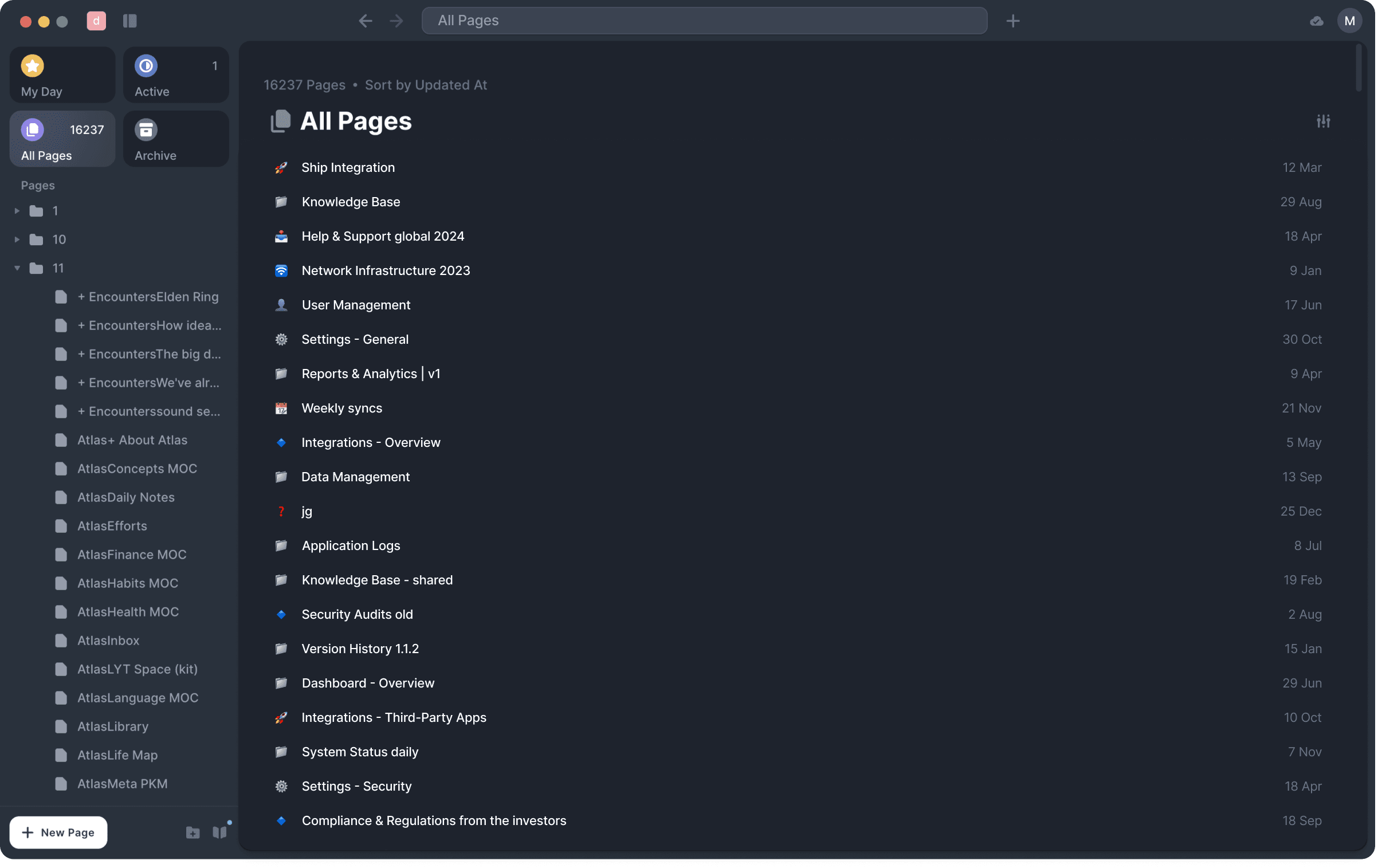
Starting point - All pages in the user's volt (aka folder). This acts as a general intermediary page.
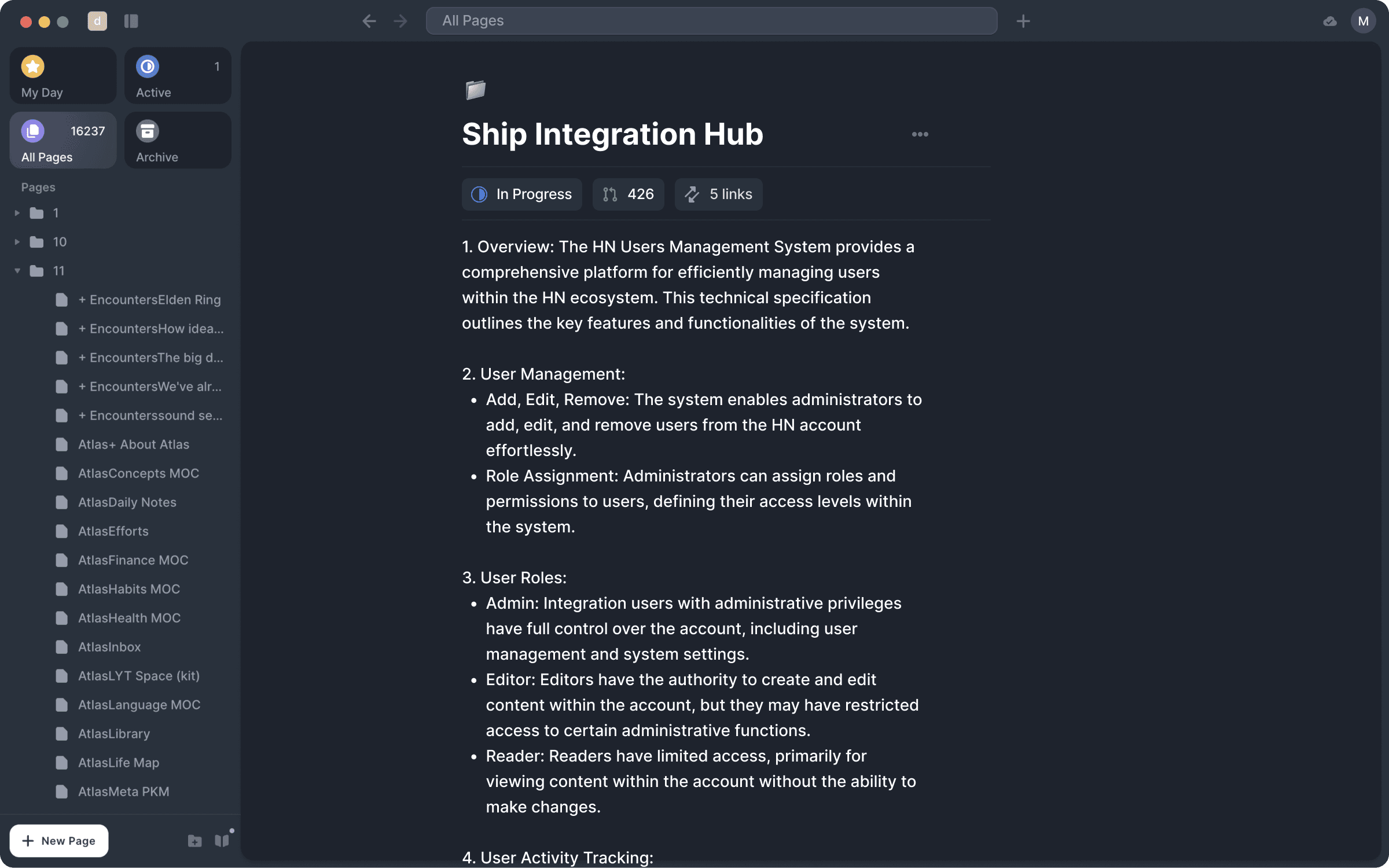
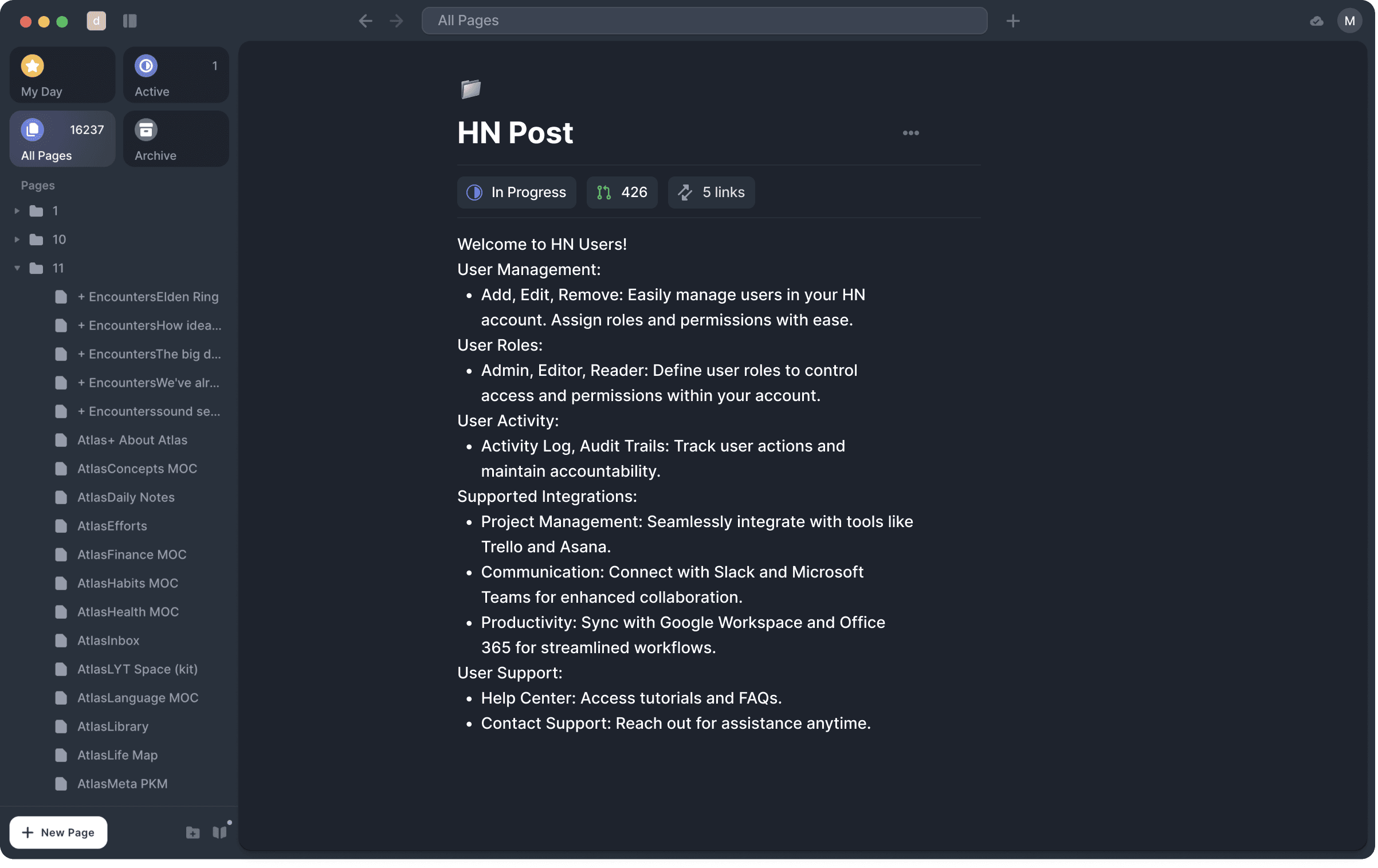
Goal for the User - Given three options to choose from, the User should choose the correct one, stated in the Task. The choice should be based on the previews and the result will demonstrate the effectiveness of the introduced improvements.
End point - The page that contains information on the User Roles within the Hub Integration manual.
Now, killing two birds with one stone (hopefully), I am presenting to you the prototype flow which we put together based on the above. As you can see, the second bird here is that the said prototype is made out of complete Hi-Fi frames. Enjoy !
↓
Finally, the prototype in action. Take a look at the video or even check it out yourself :)
Finally, the prototype in action. Take a look at the video or even check it out yourself :)
Now, killing two birds with one stone (hopefully), I am presenting to you the prototype flow which we put together based on the above. As you can see, the second bird here is that the said prototype is made out of complete Hi-Fi frames. Enjoy !
↓
Finally, the prototype in action. Take a look at the video or even check it out yourself.
Test it yourself ↓
USABILITY TESTING
Preparation
USABILITY TESTING
Preparation
USABILITY TESTING
Preparation
So far, we:
collected and synthesized feedback from the user on the product feature;
identified pain points and product improvements, and delivered improvement;
ran multiple explorations in Figma for various solutions, considering pros and cons, and choosing the best one;
fully designed new search experience.
So what is left? Usability testing !
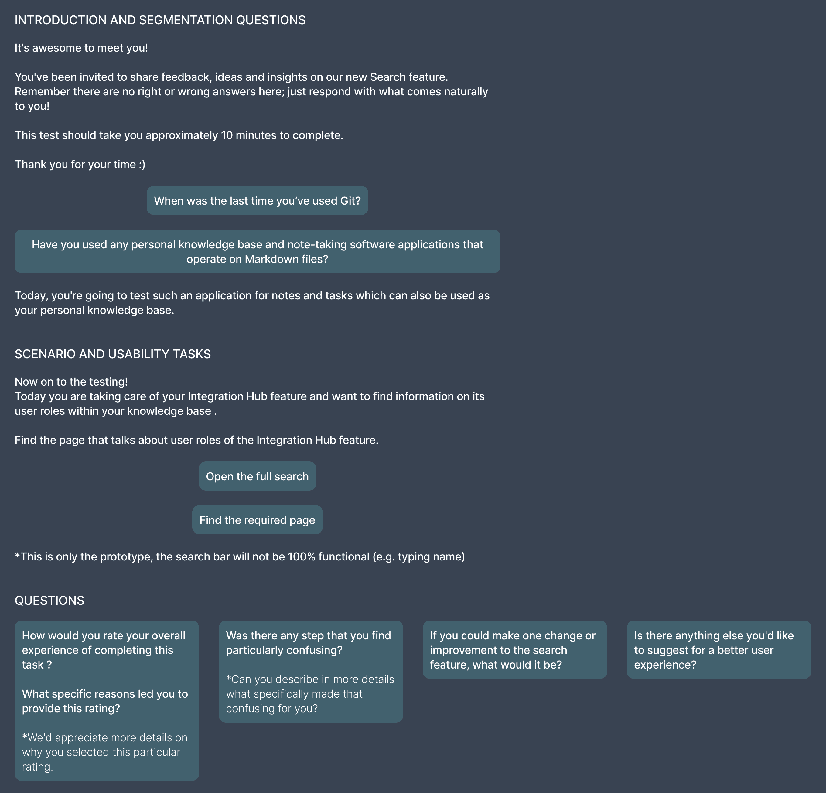
Since we were creating the prototype for the scenario, let me present you with the Script for the testing.


USABILITY TESTING
Interviews
USABILITY TESTING
Interviews
USABILITY TESTING
Interviews
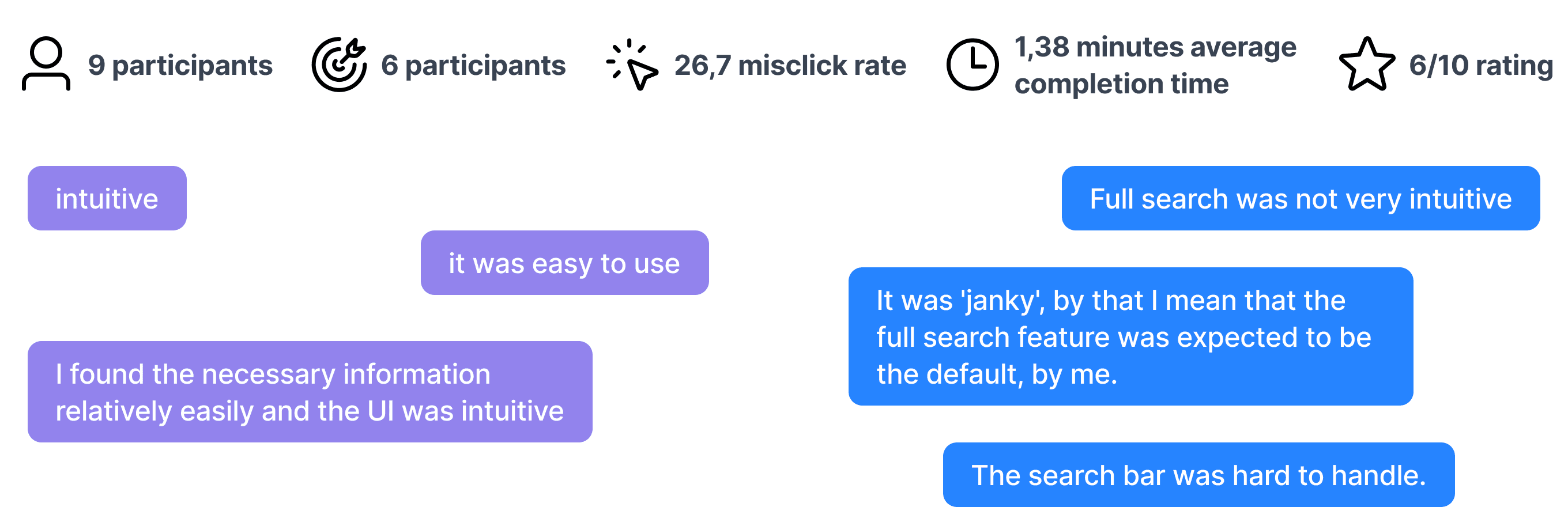
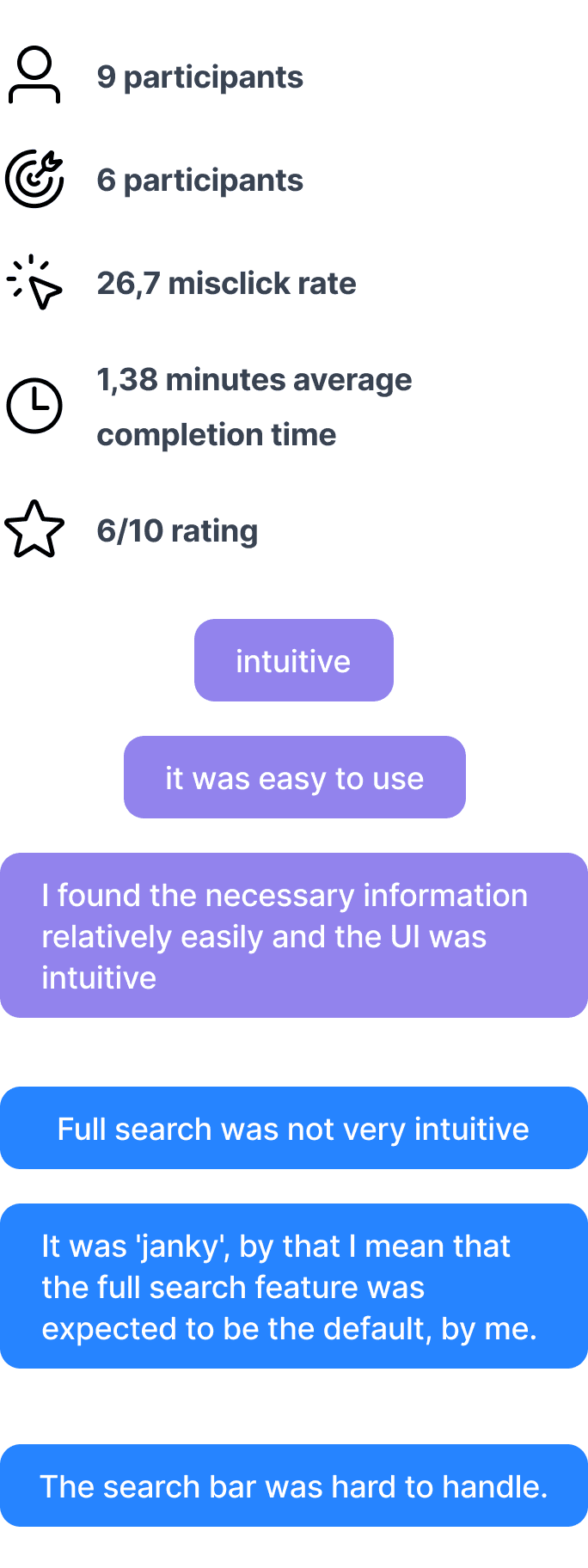
To get the results rapidly, we used Ballpark for the Testing itself. Compared to Maze, which I used for one of my bootcamp studies, Ballpark allows you to recruit participants within the platform. With that, you can choose the ideal target users for your study, based on the age, country, occupation, etc.
To get the results rapidly, we used Ballpark for the Testing itself. Compared to Maze, which I used for one of my bootcamp studies, Ballpark allows you to recruit participants within the platform. With that, you can choose the ideal target users for your study, based on the age, country, occupation, etc.
To get the results rapidly, we used Ballpark for the Testing itself. Compared to Maze, which I used for one of my bootcamp studies, Ballpark allows you to recruit participants within the platform. With that, you can choose the ideal target users for your study, based on the age, country, occupation, etc.

USABILITY TESTING
Key learnings
USABILITY TESTING
Key learnings
USABILITY TESTING
Key learnings
After the testing was completed, we finalised the feedback and outline the Key learnings. We further used it to reiterate the prototype and perform another testing.
After the testing was completed, we finalised the feedback and outline the Key learnings. We further used it to reiterate the prototype and perform another testing.
After the testing was completed, we finalised the feedback and outline the Key learnings. We further used it to reiterate the prototype and perform another testing.
GENERAL
GENERAL
The prototype interaction for the Search bar is a bit confusing - it was expected to type in the search and not get it on click (prototype limitations).
The prototype interaction for the Search bar is a bit confusing - it was expected to type in the search and not get it on click (prototype limitations).
SPECIFIC
SPECIFIC
For first-time users, it’s not too intuitive to find the Full Search since it doesn’t show unless you click the search bar at all (The Full Search was expected to be default Search for first-time users);
Folders for the presented results/storing data+presenting could be beneficial;
For first-time users, it’s not too intuitive to find the Full Search since it doesn’t show unless you click the search bar at all (The Full Search was expected to be default Search for first-time users);
Folders for the presented results/storing data+presenting could be beneficial;
USABILITY TESTING
Next steps
USABILITY TESTING
Next steps
USABILITY TESTING
Next steps
The net steps are:
Revisit the scope of the testing. Due to the timeframe of our study, I went all in on the implementing several changes which touched different parts of the product (General interaction + Specific Search process). It didn't harm the study much but, we could definitely notice a pattern of slight confusion - what were we actually testing.
Sync with the team and prioritise what feedback would be implemented first.
Reiterate
Test
Reiterate
You get the point :)
This study was possible thanks to amazing people at acreom, especially Slavo Glinsky who mentored me for the whole duration of this internship 🙏🏼
© Val Anfinogenova 2024
© Val Anfinogenova 2024
Role
User Research
Product Strategy
UI Design
Interaction Design
Usability Testing
Tools
Zoom
Figma
Chat GPT
Figjam
Timeline
5 weeks
Product
Web app
