Helping Patreon creators increase their discoverability

This project aimed to enhance the search process for the users.
Currently, there's no structured way to find the creators, and the order of search results is quite random, which leads to decreased patron engagement. The improvement should lead to increased patronage, higher creator satisfaction, and overall growth in the platform’s user base and revenue.
Role
Role
User Research
User Research
Product Strategy
Product Strategy
UI Design
UI Design
Interaction Design
Interaction Design
Usability Testing
Usability Testing
Tools
Tools
Zoom
Zoom
Figma
Figma
Chat GPT
Chat GPT
Figjam
Figjam
Timeline
Timeline
5 weeks
5 weeks
Platform
Platform
Web app
Web app
The Problem
The Problem
The Problem
Individuals find it difficult to find creators they would like to support online because there is no curated content nor clear filtering options.
This is a problem because creators are missing opportunity to be discovered and make a living out of their craft.
Individuals find it difficult to find creators they would like to support online because there is no curated content nor clear filtering options.
This is a problem because creators are missing opportunity to be discovered and make a living out of their craft.
Individuals find it difficult to find creators they would like to support online because there is no curated content nor clear filtering options.
This is a problem because creators are missing opportunity to be discovered and make a living out of their craft.
INITIAL ASSESSMENT
At first, we came up with the idea to rework Patreon's whole page and make it in the same branding as their marketing website so that it doesn’t look like we’re using two completely different products.
Additionally, we had an idea of adding a Feed page and recommendations based on what you already follow, turning it into one of the Discovery platforms, which are, currently, so adored around the world.
INITIAL RESEARCH
While those felt like great improvements, and we were super excited about it, we still wanted to conduct more research and read materials on why Patreon is so empty from the beginning despite the users’ feedback.
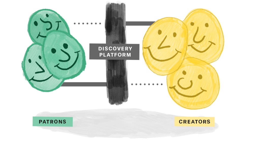
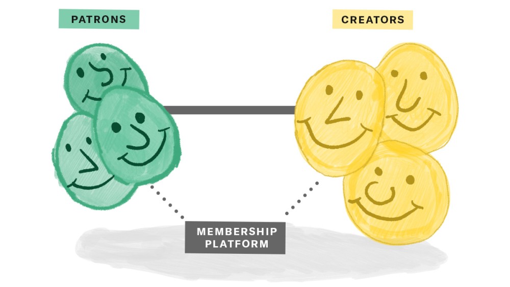
After going through Patreon’s Head of Product interview (Wyatt Jenkins), we stumbled on the clear reasoning for keeping it this way. There’s a lot to mention: ethical, cost-effective, low-effort, and other reasons, but the one to unite them all - they want to keep it a Membership platform and be a fully Creator-Centric place.
Following that, they don’t need to influence users’ search in any way, they don’t need to suggest more content to the users, and they don’t need to build relationships between fans themselves.
"For me, this boils down to a fundamental issue: Why isn’t Patreon a discovery platform? Answer? Patreon was built for creators to nurture direct relationships with their audience. We don’t want to get in between creators and their community; in other words, if we focused on discovery, it would lead to some not-so-creator-centric decisions".
Initial Assessment
At first, we came up with the idea to rework Patreon's whole page and make it in the same branding as their marketing website so that it doesn’t look like we’re using two completely different products.
Additionally, we had an idea of adding a Feed page and recommendations based on what you already follow, turning it into one of the Discovery platforms, which are, currently, so adored around the world.
Initial Research
While that felt like a great motive, and we were super excited about it, we decided to read materials on why Patreon is so empty from the beginning despite the users’ feedback.
After going through Patreon’s Head of Product interview (Wyatt Jenkins), we stumbled on the clear reasoning for keeping it this way.
There’s a lot to mention: ethical, cost-effective, low-effort, and other reasons, but the one to unite them all - they want to keep it a Membership platform and be a fully Creator-Centric place.
INITIAL RESEARCH OUTCOME
So the overall morale of the product became quite clear to us.
We decided to keep what they have currently and build on top of it, in simpler words, to enhance the current experience and not build a new one. Hence, as most of the user interviews’ feedback suggested (elaborated further down) - we went forward with implementing filters to the search as well as the categories, which seems essential for streamlining the search process.
Further, we decided to work with the creator’s profile view and the search results presentation. Currently, presented profiles have limited information that doesn’t tell us enough about the creators. Hence, we decided to add more details, such as number of followers and number of posts to the profile card.
Initial Research Outcome
So the overall morale of the product became quite clear to us.
We decided to keep what they have currently and build on top of it, in simpler words, to enhance the current experience and not build a new one. Hence, as most of the user interviews’ feedback suggested (elaborated further down) - we went forward with implementing filters to the search as well as the categories, which seems essential for streamlining the search process.
Further, we decided to work with the creator’s profile view and the search results presentation. Currently, presented profiles have limited information that doesn’t tell us enough about the creators. Hence, we decided to add more details, such as number of followers and number of posts to the profile card.
The Process
The Process
The Process


DISCOVER
User Interviews | Preparation
DISCOVER
User Interviews | Preparation
DISCOVER
User Interviews | Preparation
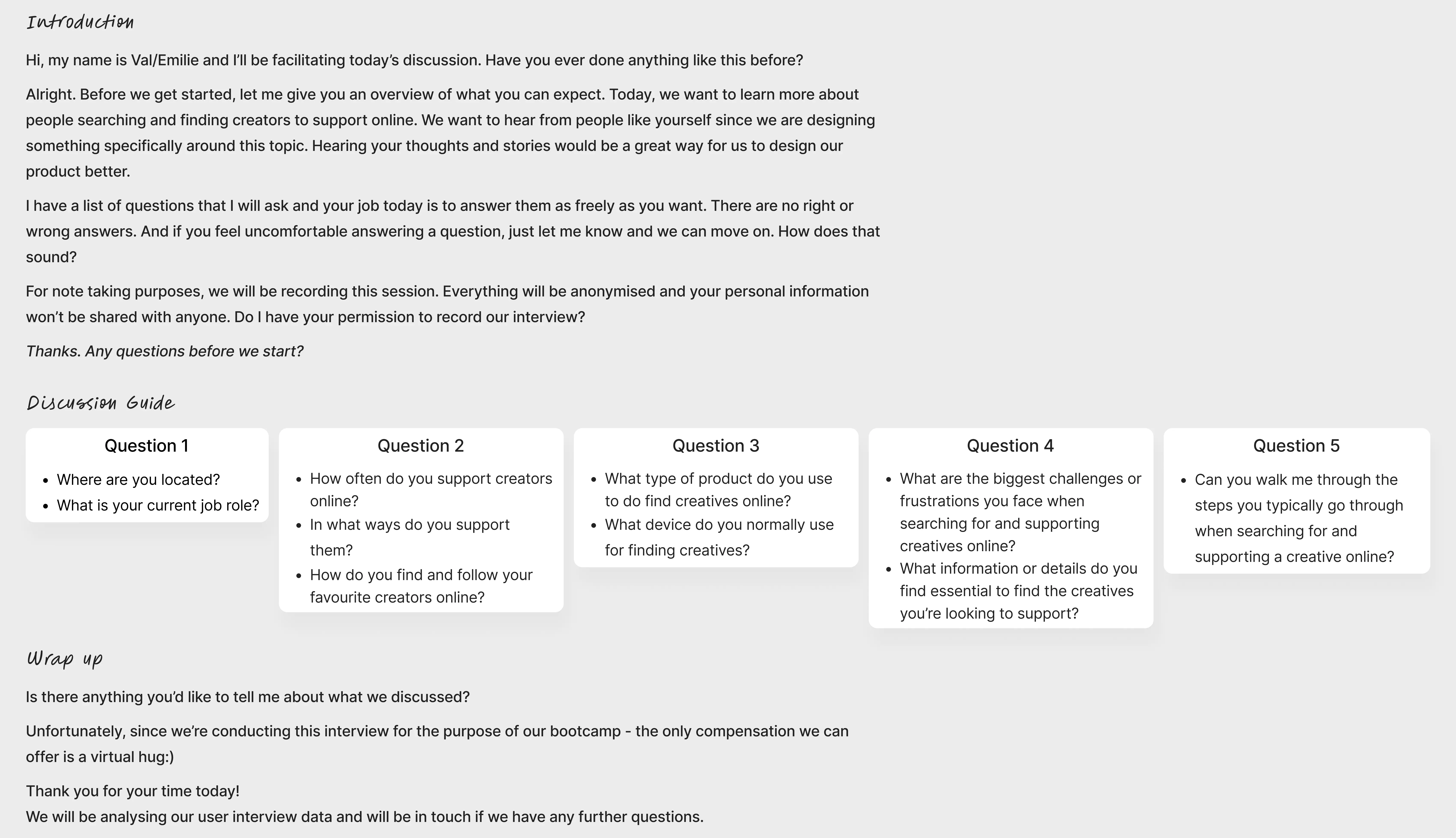
To understand users' pain points and learn their overall experience with supporting creatives online, we decided to conduct user interviews. To have a structure and avoid having a brain freeze during the interview, we wrote down our Interview Script ↓
To understand users' pain points and learn their overall experience with supporting creatives online, we decided to conduct user interviews. To have a structure and avoid having a brain freeze during the interview, we wrote down our Interview Script ↓
To understand users' pain points and learn their overall experience with supporting creatives online, we decided to conduct user interviews. To have a structure and avoid having a brain freeze during the interview, we wrote down our Interview Script ↓


DISCOVER
User Interviews | Interviews
DISCOVER
User Interviews | Interviews
DISCOVER
User Interviews | Interviews
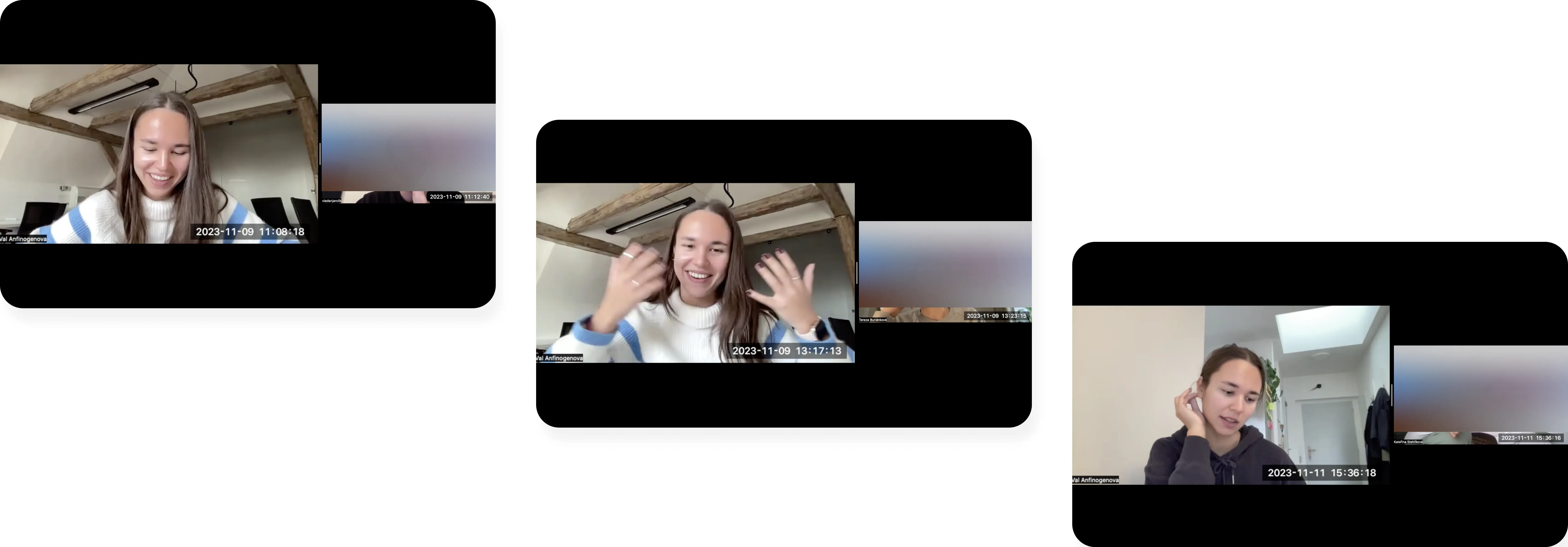
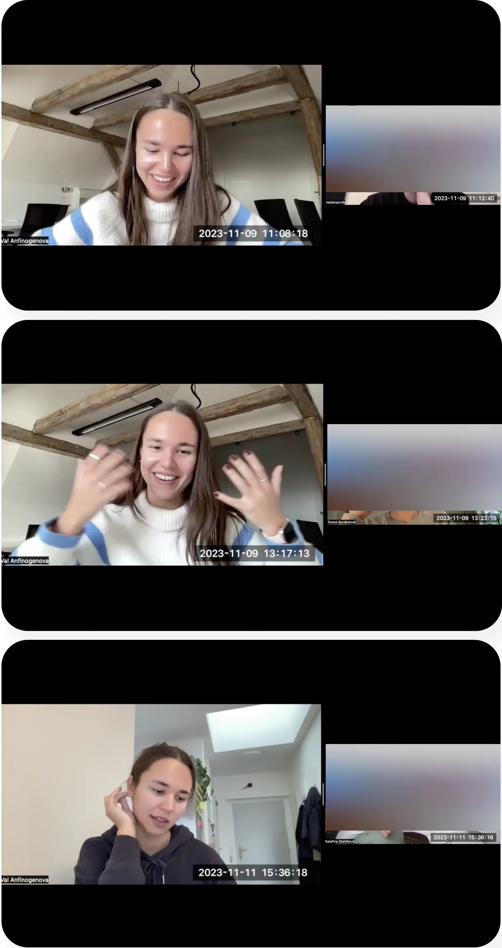
After proofreading our Interview Script, we proceeded to execute the interviews. Being mindful of the deadline and the scope of this project, I conducted three interviews which gave me enough insights to state the problem.
After proofreading our Interview Script, we proceeded to execute the interviews. Being mindful of the deadline and the scope of this project, I conducted three interviews which gave me enough insights to state the problem.
After proofreading our Interview Script, we proceeded to execute the interviews. Being mindful of the deadline and the scope of this project, I conducted three interviews which gave me enough insights to state the problem.

DISCOVER
User Interviews | Outcome
DISCOVER
User Interviews | Outcome
DISCOVER
User Interviews | Outcome
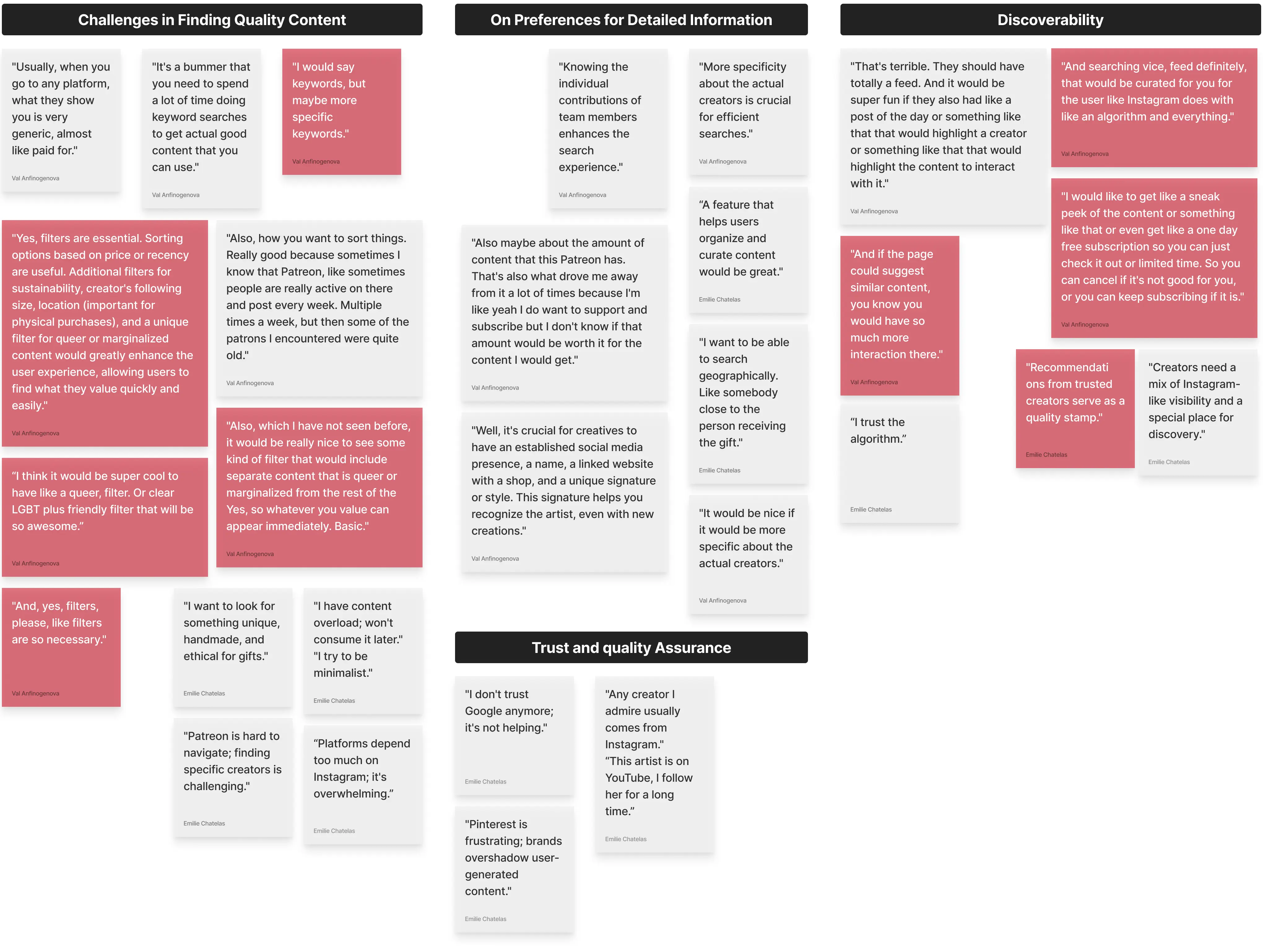
Having conducted our User Interviews, we went ahead with the synthesis of the data using Chat GPT.
Having conducted our User Interviews, we went ahead with the synthesis of the data using Chat GPT.
Having conducted our User Interviews, we went ahead with the synthesis of the data using Chat GPT.
ℹ The identified patterns are represented in black titles.
ℹ The patterns which we focused on are highlighted in red.
ℹ The identified patterns are represented in black titles.
ℹ The patterns which we focused on are highlighted in red.
ℹ The identified patterns are represented in black titles.
ℹ The patterns which we focused on are highlighted in red.


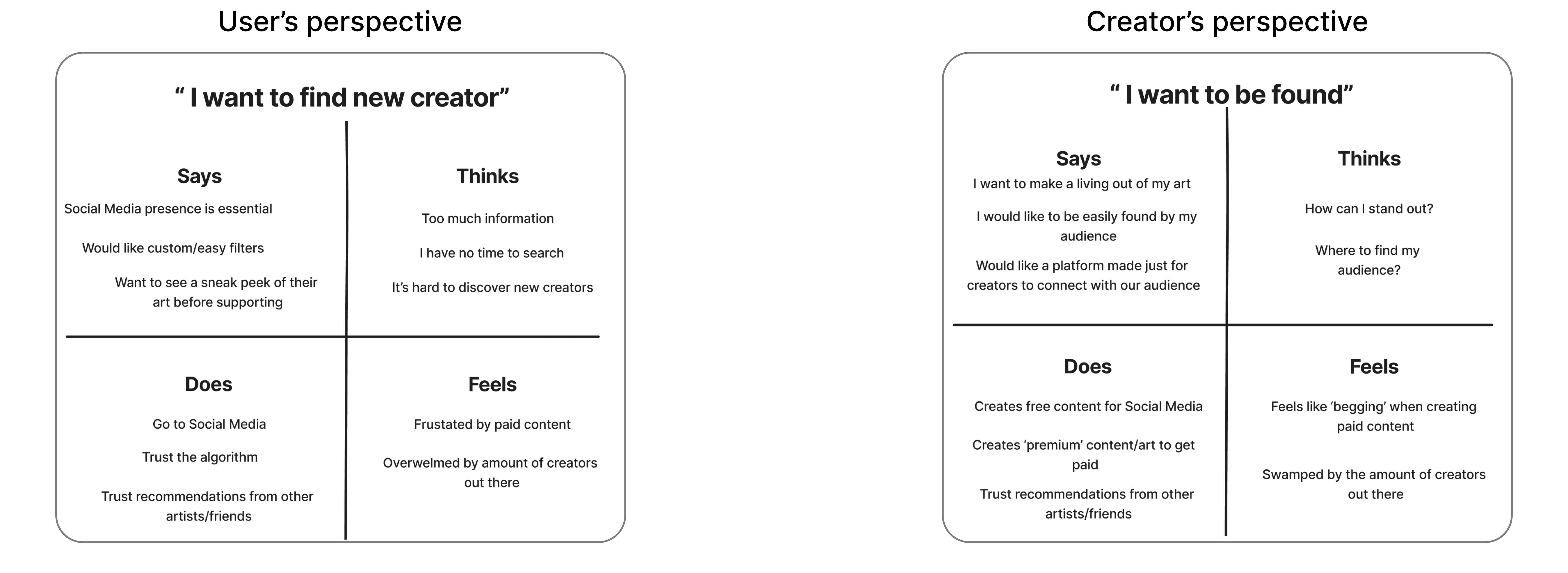
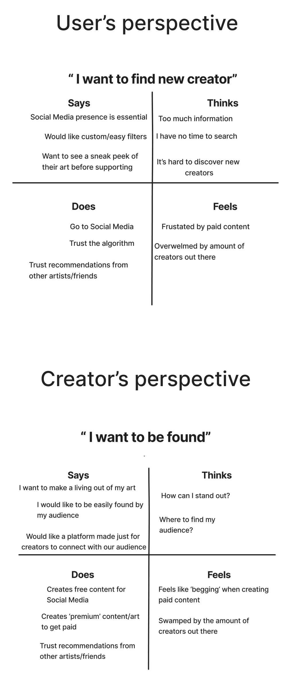
Subsequently, to make the problem statement process more transparent, we also created scenarios.
Subsequently, to make the problem statement process more transparent, we also created scenarios.
Subsequently, to make the problem statement process more transparent, we also created scenarios.

DEFINE
Problem Space
DEFINE
Problem Space
DEFINE
Problem Space
Our defining process consisted of analyzing our results of the Discover phase and outlining our problem space clearly. With the help of all the materials we've gathered so far, we stated the following:
Our defining process consisted of analyzing our results of the Discover phase and outlining our problem space clearly. With the help of all the materials we've gathered so far, we stated the following:
Our defining process consisted of analyzing our results of the Discover phase and outlining our problem space clearly. With the help of all the materials we've gathered so far, we stated the following:
Individuals find it difficult to find creators they would like to support online because there is no curated content nor clear filtering options.
Individuals find it difficult to find creators they would like to support online because there is no curated content nor clear filtering options.
Individuals find it difficult to find creators they would like to support online because there is no curated content nor clear filtering options.
This is a problem because creators are missing opportunities to be discovered and make a living out of their craft.
This is a problem because creators are missing opportunities to be discovered and make a living out of their craft.
This is a problem because creators are missing opportunities to be discovered and make a living out of their craft.
IDEATE 1
Usability Review
IDEATE 1
Usability Review
IDEATE 1
Usability Review
To kickstart the ideation process for the potential solution, we first proceeded with the usability review of Patreon.
It allowed us to see the root of the problem and gather more potential solutions.
To kickstart the ideation process for the potential solution, we first proceeded with the usability review of Patreon.
It allowed us to see the root of the problem and gather more potential solutions.
To kickstart the ideation process for the potential solution, we first proceeded with the usability review of Patreon.
It allowed us to see the root of the problem and gather more potential solutions.
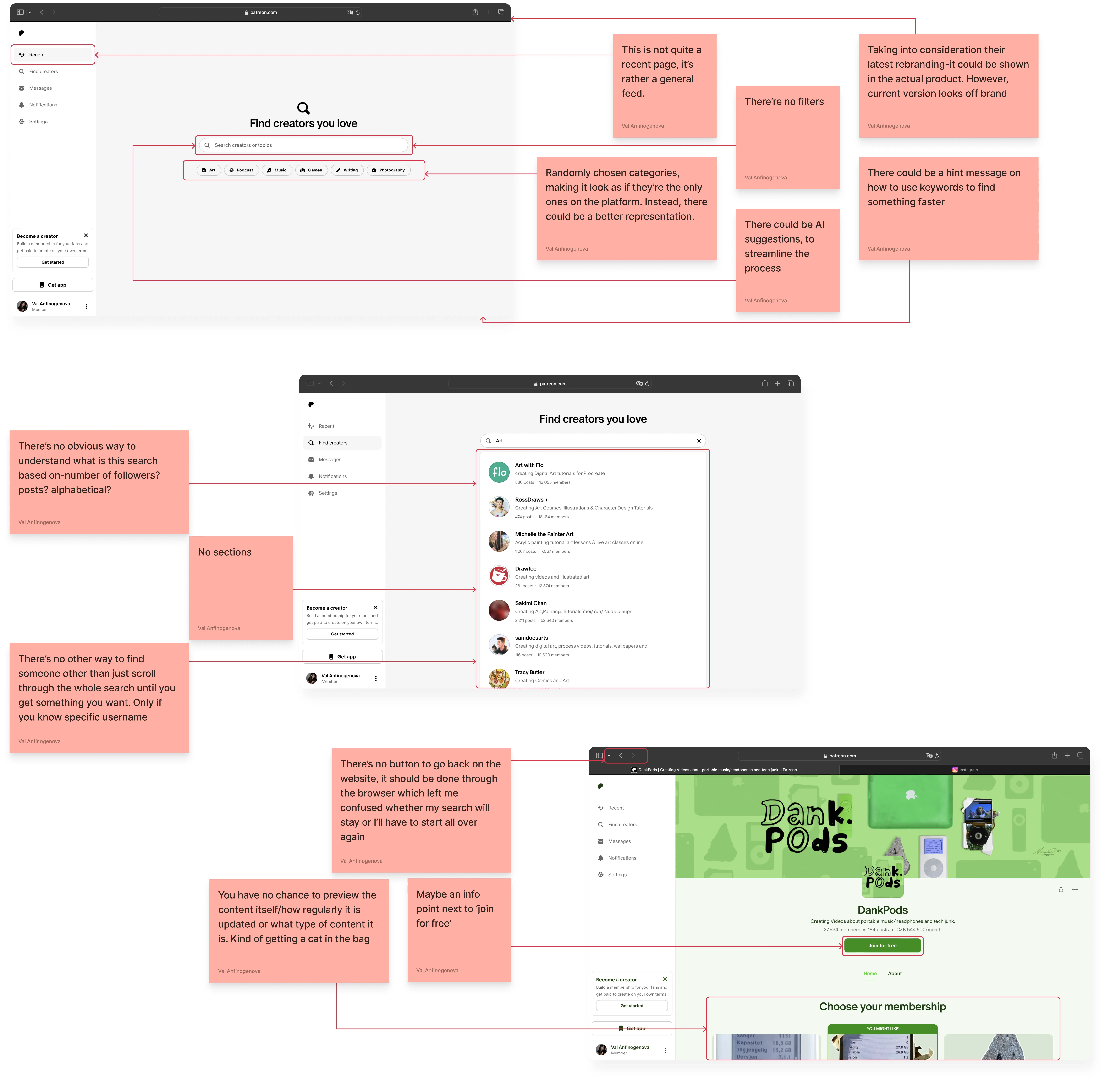


During the usability review, we identified the main pain points that correlate with the feedback from interviews:
No filters;
No categories;
No logic behind the presented search results.
During the usability review, we identified the main pain points that correlate with the feedback from interviews:
No filters;
No categories;
No logic behind the presented search results.
IDEATE 2
Competitor Analysis
IDEATE 2
Competitor Analysis
IDEATE 2
Competitor Analysis
The next logical step we took, was the competitor analysis. As well as allowing us to deepen into the root of the issue, like the usability review, it presented us with the potential keys to solving the issue.
The next logical step we took, was the competitor analysis. As well as allowing us to deepen into the root of the issue, like the usability review, it presented us with the potential keys to solving the issue.
The next logical step we took, was the competitor analysis. As well as allowing us to deepen into the root of the issue, like the usability review, it presented us with the potential keys to solving the issue.
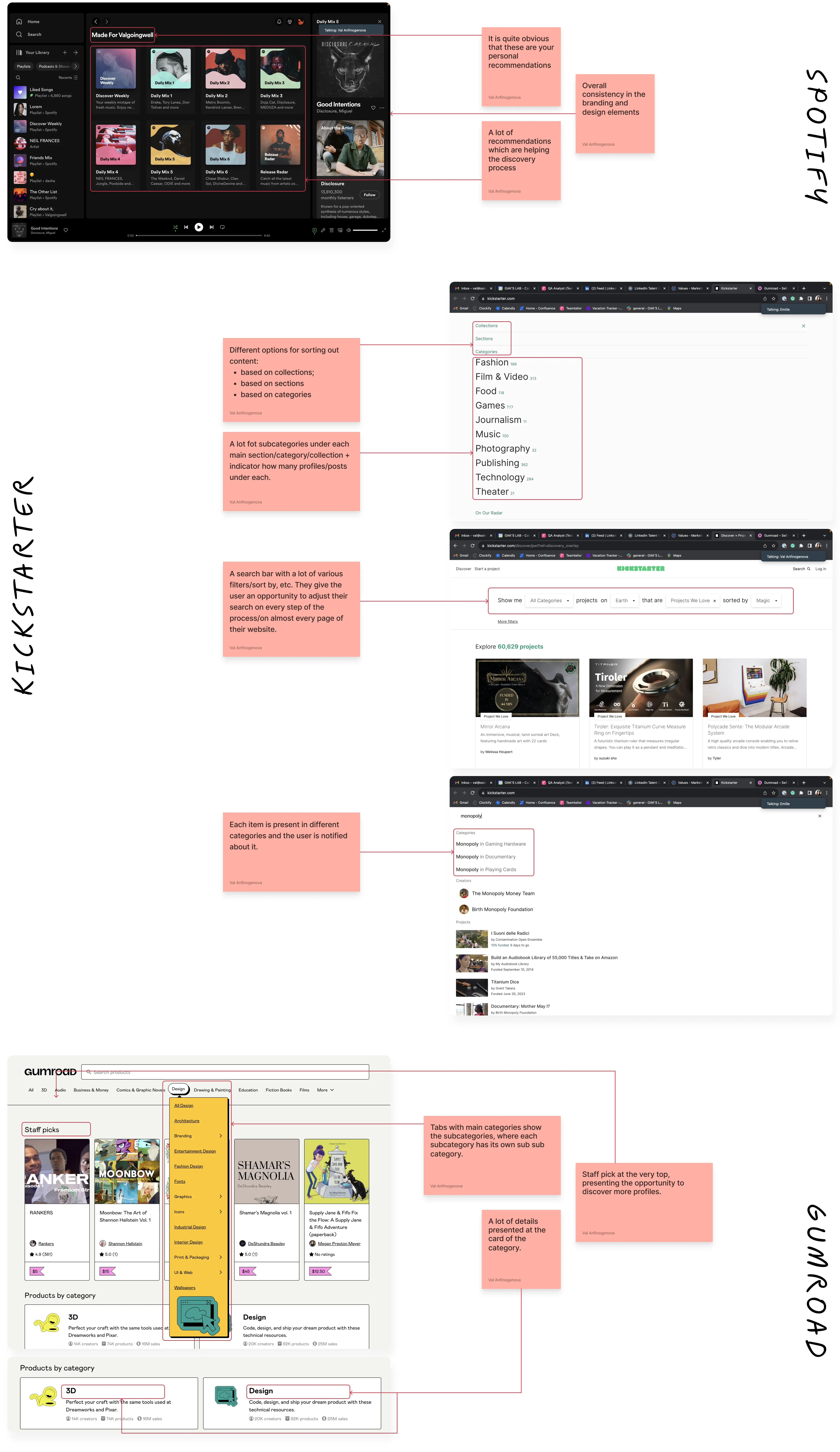


Throughout our Competitor Analysis, we found several options to address the paint points identified during the Usability review:
Various filters are present in Kickstarter and Gumroad;
In all the competitors, both categories and subcategories are introduced;
The presented results and categories are in alphabetical order in both Kickstarter and Gumroad.
IDEATE 3
Mind Mapping
IDEATE 3
Mind Mapping
IDEATE 3
Mind Mapping
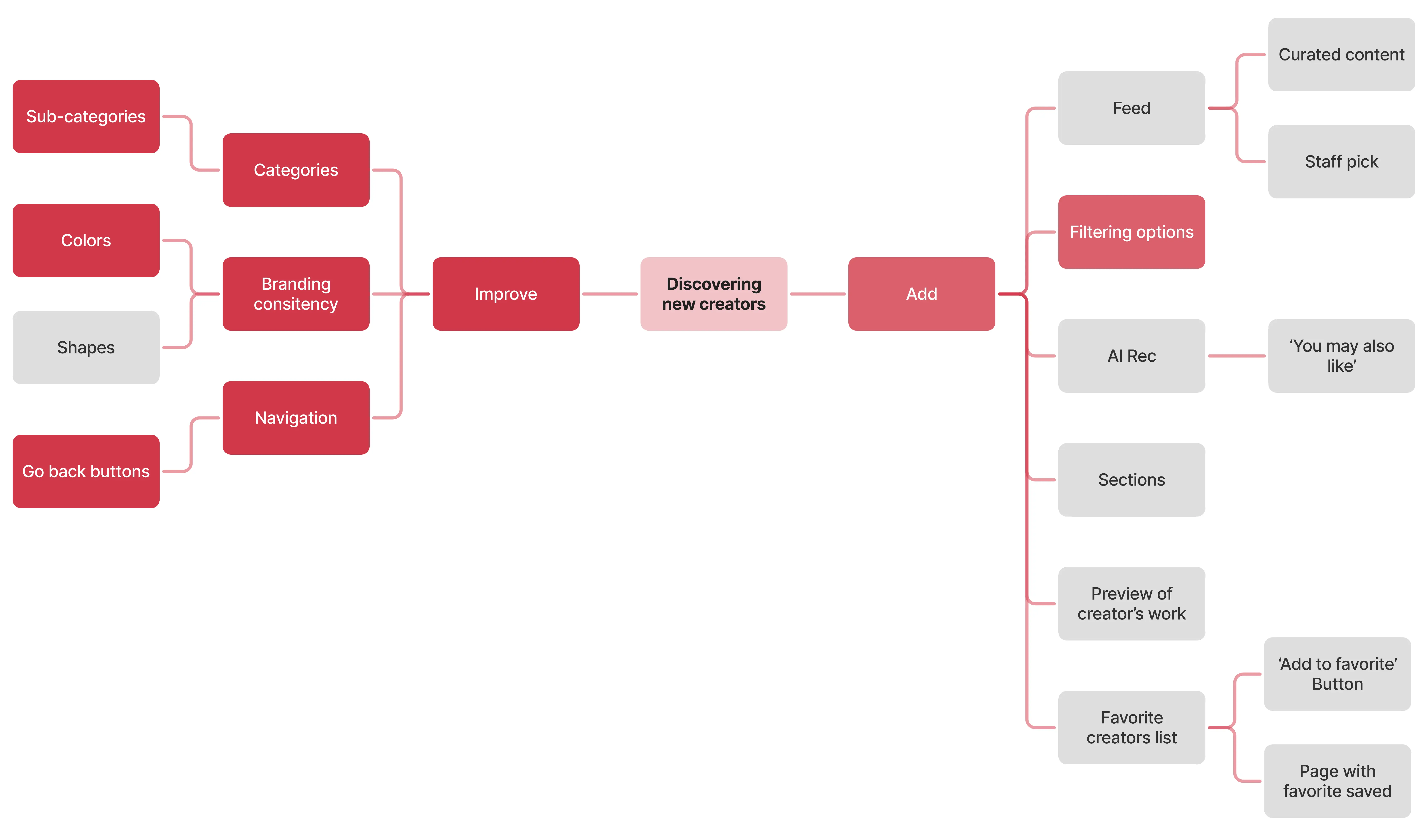
To conclude our active ideation process, we decided to quickly sketch a mind map of our potential solutions ↓
To conclude our active ideation process, we decided to quickly sketch a mind map of our potential solutions ↓
To conclude our active ideation process, we decided to quickly sketch a mind map of our potential solutions ↓
The highlighted items are features we considered for improvement
ℹ The highlighted items are features we considered for improvement.
ℹ The highlighted items are features we considered for improvement.

IDEATE
Solution
IDEATE
Solution
IDEATE
Solution
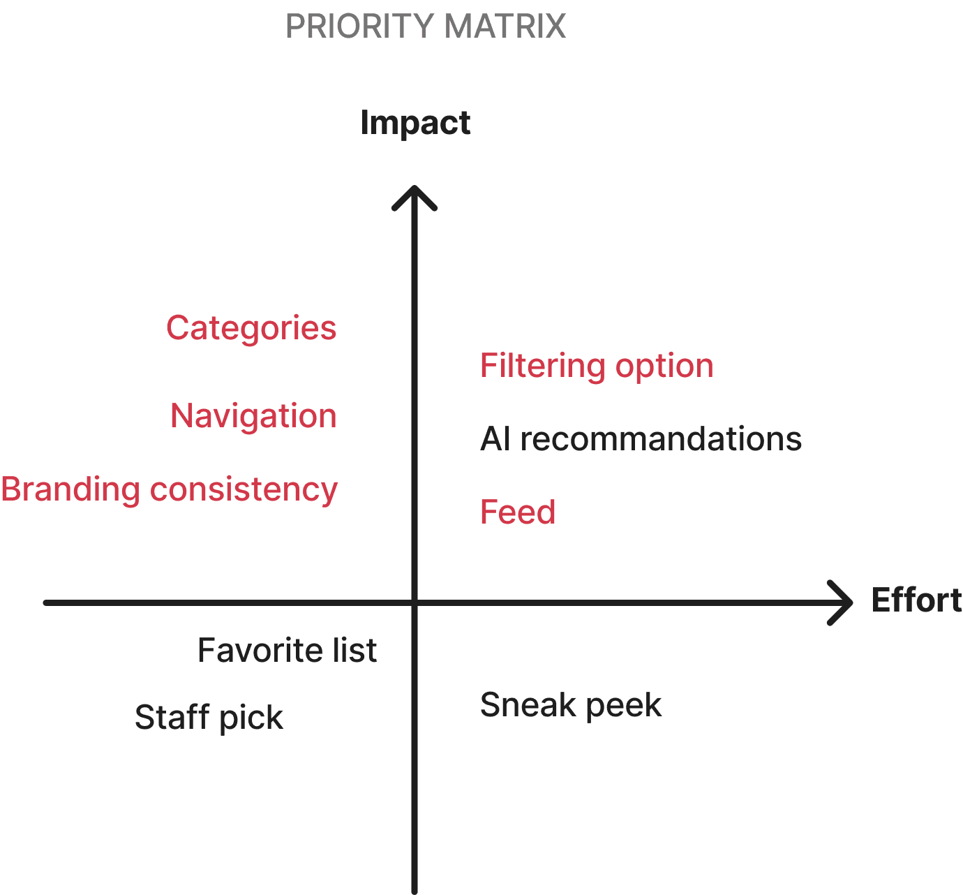
To pin down the solution that we would work on, we created a priority matrix.
To pin down the solution that we would work on, we created a priority matrix.
To pin down the solution that we would work on, we created a priority matrix.
The highlighted items are parts of our solution
ℹ The highlighted items are parts of our solution.
ℹ The highlighted items are parts of our solution.
Throughout our Competitor Analysis, we found several options to address the paint points identified during the Usability review:
Various filters are present in Kickstarter and Gumroad;
In all the competitors, both categories and subcategories are introduced;
The presented results and categories are in alphabetical order in both Kickstarter and Gumroad.
During the usability review, we identified the main pain points that correlate with the feedback from interviews:
No filters;
No categories;
No logic behind the presented search results.
DESIGN
Rapid Wireframing
DESIGN
Rapid Wireframing
DESIGN
Rapid Wireframing
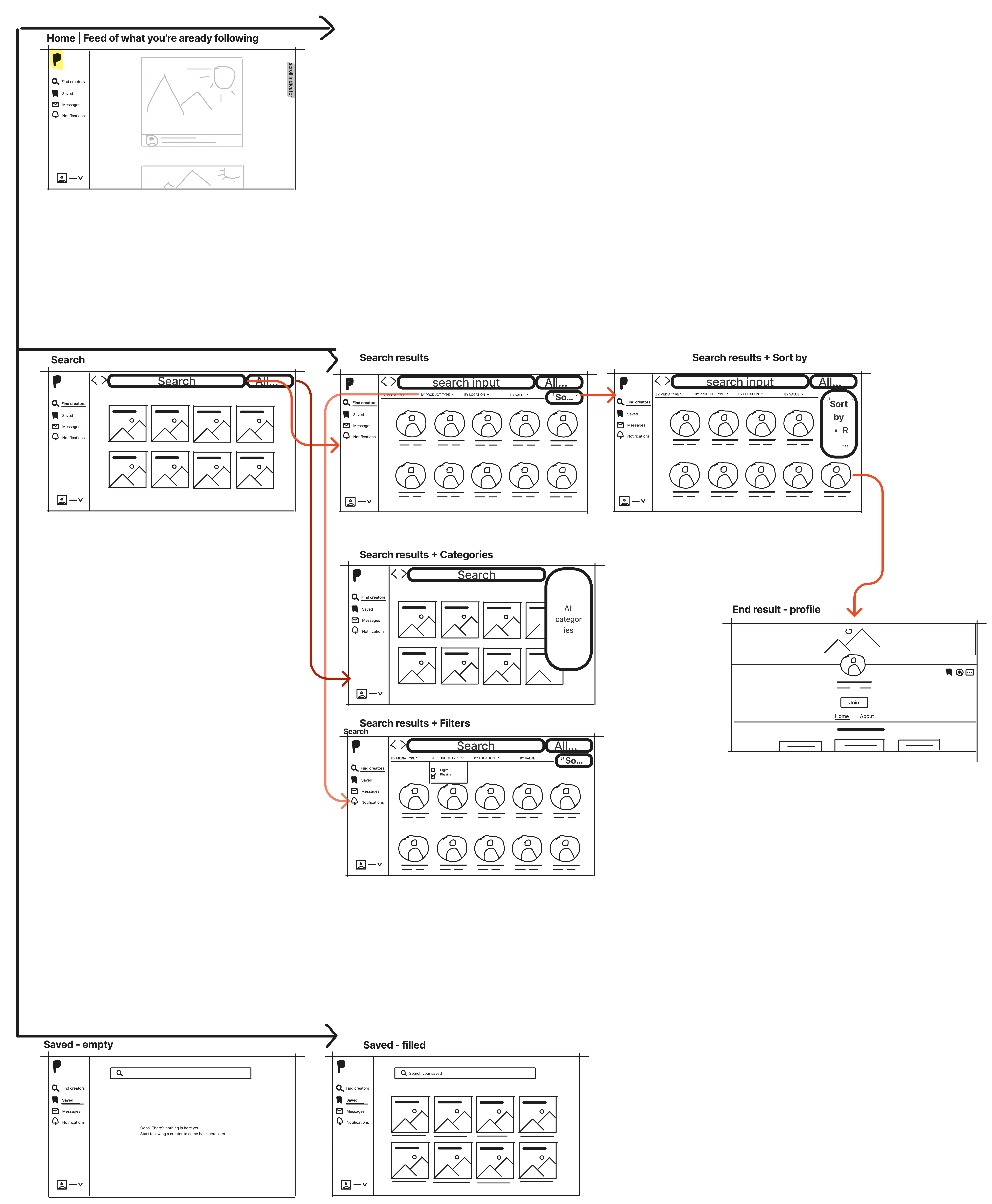
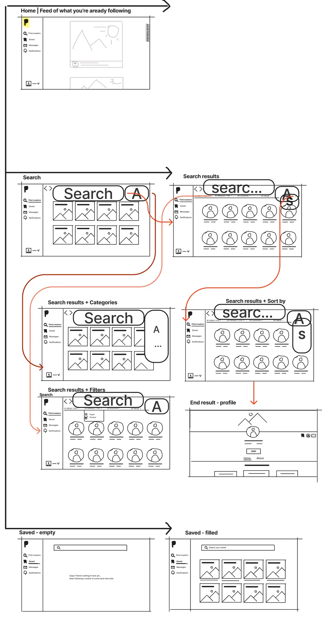
When decided on the final solution, we proceeded with rapid wireframes. Having time limitations, we ended up reiterating the wireframes only once and successfully closed this step.
When decided on the final solution, we proceeded with rapid wireframes. Having time limitations, we ended up reiterating the wireframes only once and successfully closed this step.
When decided on the final solution, we proceeded with rapid wireframes. Having time limitations, we ended up reiterating the wireframes only once and successfully closed this step.

DESIGN
Styles & Components
DESIGN
Styles & Components
DESIGN
Styles & Components
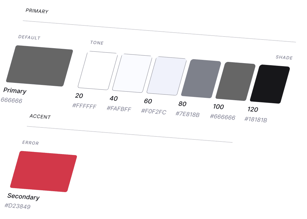
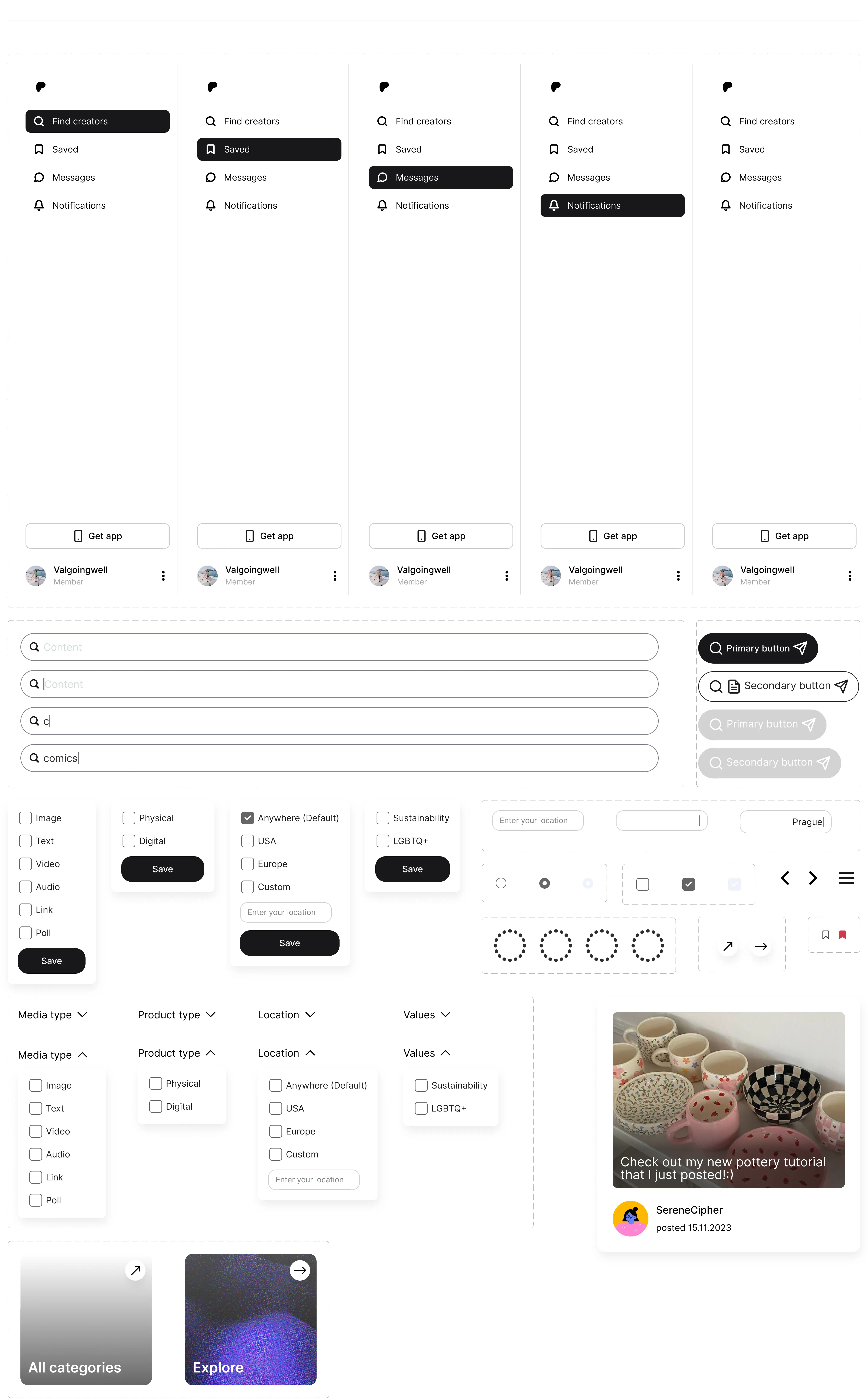
For the updated look and experience of Patreon, we decided not to deviate from the existing brand guidelines, which included colors, typography, and styles for components. For that, we found inspiration in their Design System published on the official website.
The components were initially gathered into a checklist for each of our screens and then created according to our set styles.




DESIGN
High - Fidelity Wireframes
DESIGN
High - Fidelity Wireframes
DESIGN
High - Fidelity Wireframes
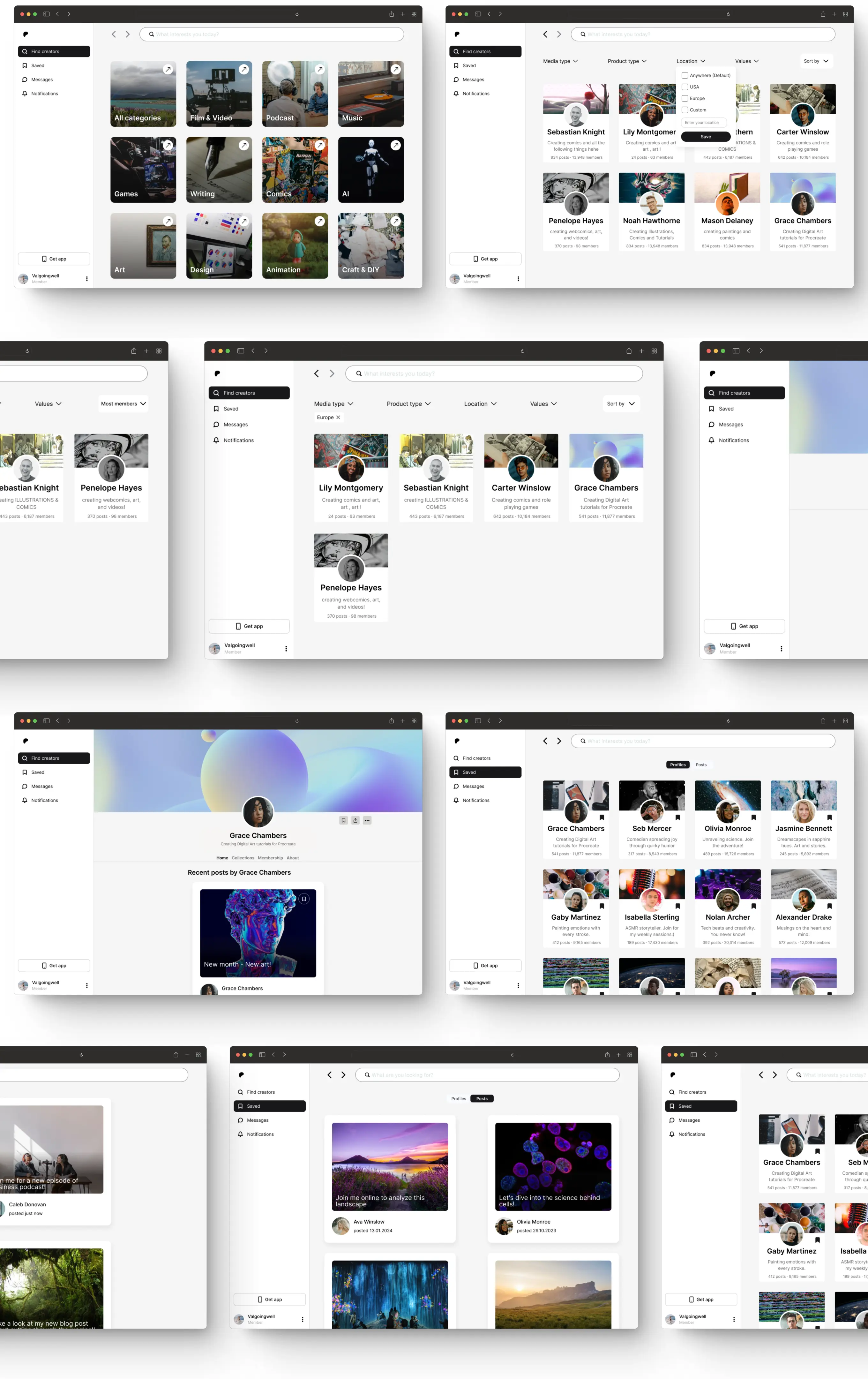
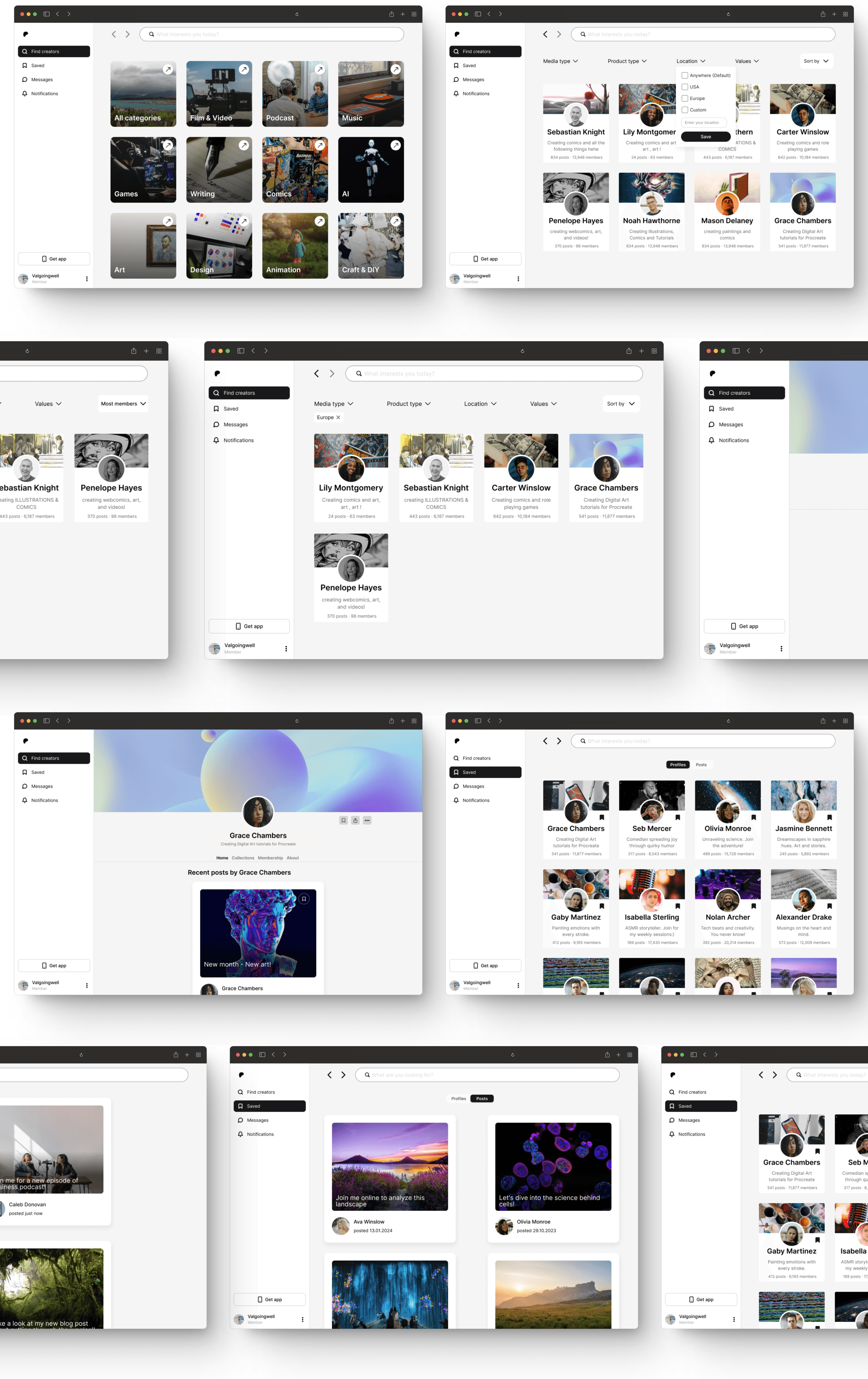
All our rapid wireframes combined with the components came together as a number of high-fidelity wireframes which you can see below.
All our rapid wireframes combined with the components came together as a number of high-fidelity wireframes which you can see below.
All our rapid wireframes combined with the components came together as a number of high-fidelity wireframes which you can see below.

DESIGN
High-Fidelity Prototype
DESIGN
High-Fidelity Prototype
DESIGN
High-Fidelity Prototype
As a final design step, we put together all the high-fidelity wireframes and interactions for a fully functioning prototype which you can see below ↓
As a final design step, we put together all the high-fidelity wireframes and interactions for a fully functioning prototype which you can see below ↓
As a final design step, we put together all the high-fidelity wireframes and interactions for a fully functioning prototype which you can see below ↓
USABILITY TESTING
Preparation
USABILITY TESTING
Preparation
USABILITY TESTING
Preparation
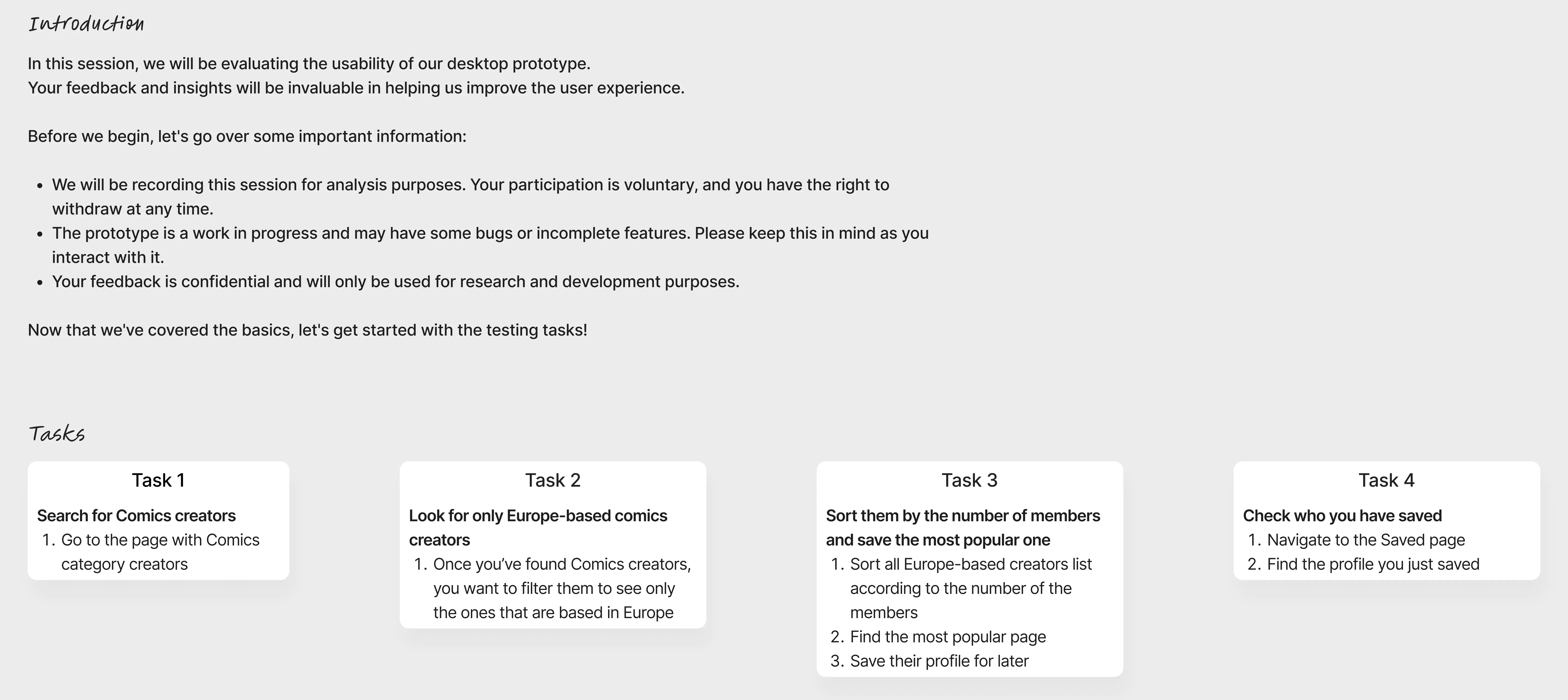
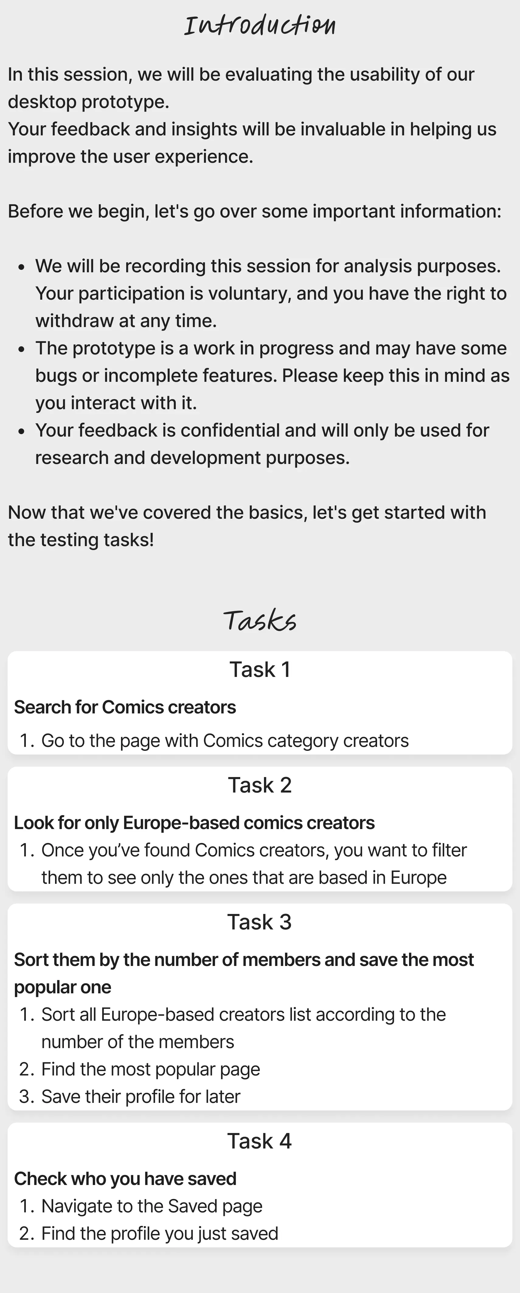
To test our high-fidelity prototype, we went ahead with conducting usability testing interviews. Before executing the interviews, we created the script to follow, where we described the purpose of the testing as well as outlined the tasks to complete.
To test our high-fidelity prototype, we went ahead with conducting usability testing interviews. Before executing the interviews, we created the script to follow, where we described the purpose of the testing as well as outlined the tasks to complete.
To test our high-fidelity prototype, we went ahead with conducting usability testing interviews. Before executing the interviews, we created the script to follow, where we described the purpose of the testing as well as outlined the tasks to complete.

USABILITY TESTING
Interviews
USABILITY TESTING
Interviews
USABILITY TESTING
Interviews
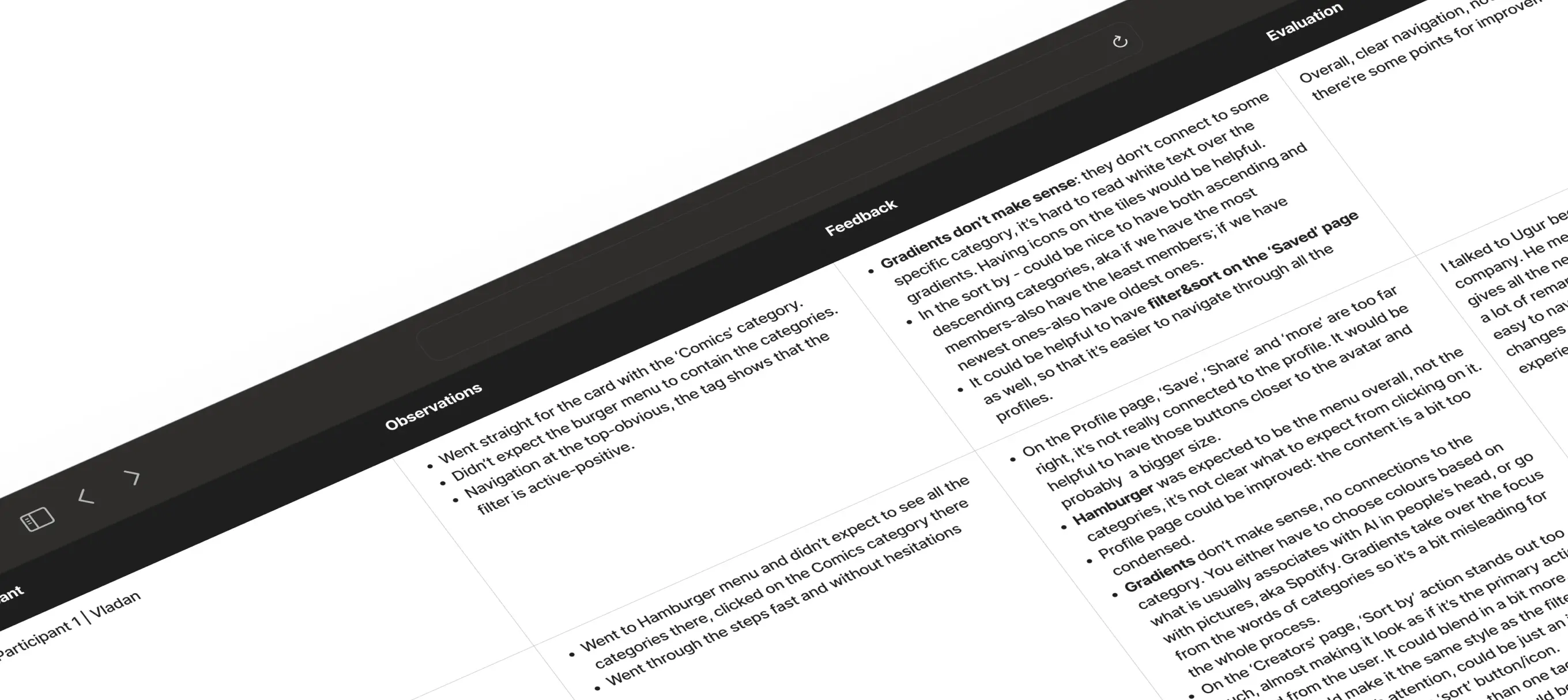
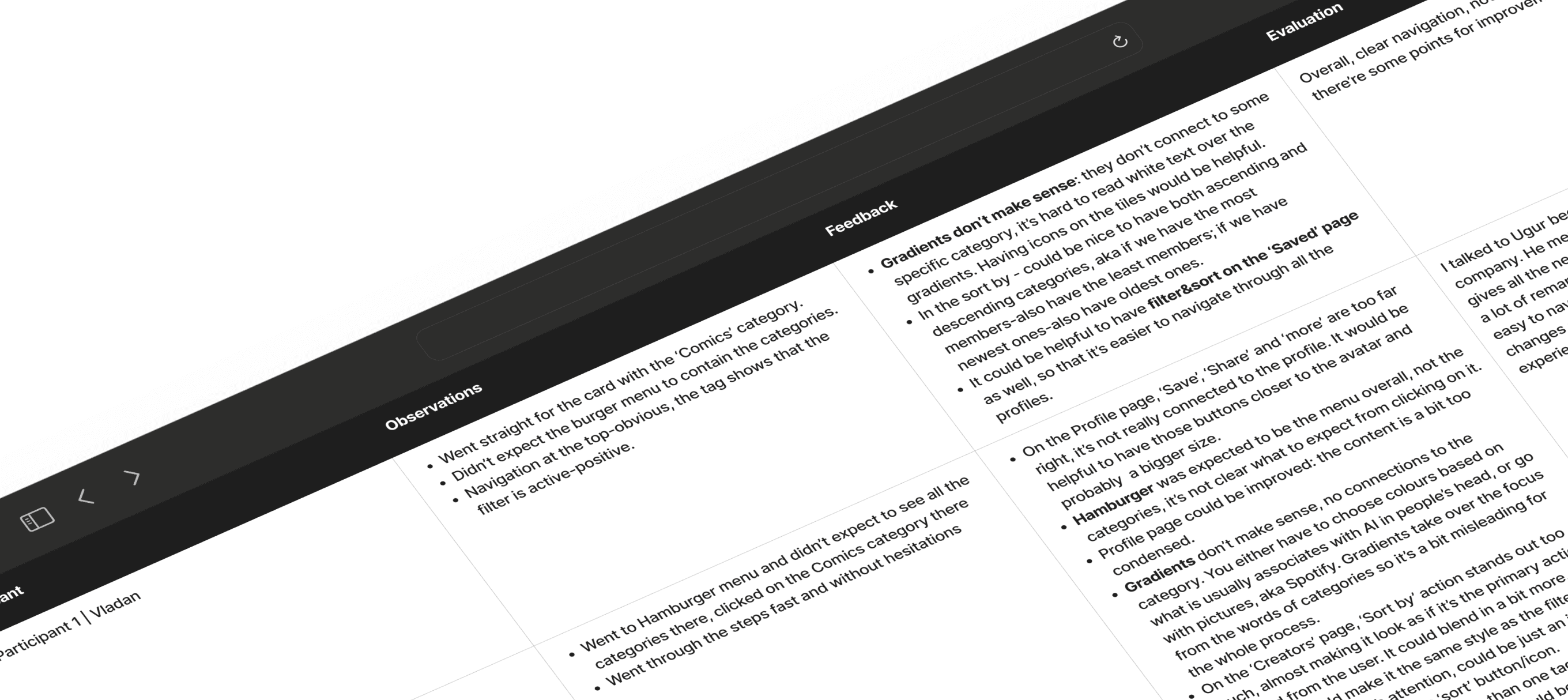
For the purpose of this usability testing, I chose four people of different backgrounds:
Product Designer x2
Software Engineer
Paralegal.
To be able to moderate these testing sessions better, I proceeded to make it happen in person. Additionally, I was recording the prototype screen and the sound, so that I'm able to come back to the reasoning in case of any confusion.

USABILITY TESTING
Three key learnings
USABILITY TESTING
Three key learnings
USABILITY TESTING
Three key learnings
Having gone through all the feedback points, I also outlined the key learnings, which would help me with the next steps:
Having gone through all the feedback points, I also outlined the key learnings, which would help me with the next steps:
Having gone through all the feedback points, I also outlined the key learnings, which would help me with the next steps:
It could be useful to add filters and 'sort by' to the page with Saved profiles/posts.
It could be useful to add filters and 'sort by' to the page with Saved profiles/posts.
It could be useful to add filters and 'sort by' to the page with Saved profiles/posts.
Improvements, such as 'fast actions' aka buttons 'share, save, copy, etc' could bring more engagement to the profiles on the search page.
Improvements, such as 'fast actions' aka buttons 'share, save, copy, etc' could bring more engagement to the profiles on the search page.
Improvements, such as 'fast actions' aka buttons 'share, save, copy, etc' could bring more engagement to the profiles on the search page.
Thinking of the chosen tags, it might look too cramped in the search section when more than two tags are introduced.
Thinking of the chosen tags, it might look too cramped in the search section when more than two tags are introduced.
Thinking of the chosen tags, it might look too cramped in the search section when more than two tags are introduced.
USABILITY TESTING
Next steps
USABILITY TESTING
Next steps
USABILITY TESTING
Next steps
Introduce filters and sorting options to the 'Saved' page as well.
Introduce filters and sorting options to the 'Saved' page as well.
Introduce filters and sorting options to the 'Saved' page as well.


Besides the save icon on the profile cards, we will add other fast actions, to streamline the exploring process.
Besides the save icon on the profile cards, we will add other fast actions, to streamline the exploring process.
Besides the save icon on the profile cards, we will add other fast actions, to streamline the exploring process.


To avoid the awkward positioning of numerous tags when chosen, we would revisit the visualization of the tags in general. It's possible, that we would get rid of the tags completely.
To avoid the awkward positioning of numerous tags when chosen, we would revisit the visualization of the tags in general. It's possible, that we would get rid of the tags completely.
To avoid the awkward positioning of numerous tags when chosen, we would revisit the visualization of the tags in general. It's possible, that we would get rid of the tags completely.


This project was part of the Memorisely UX/UI Bootcamp which lasted for 4,5 months. Throughout the course, I worked with another student, Emilie Chatelas, and we had an amazing Design team of two!:)
This project was part of the Memorisely UX/UI Bootcamp which lasted for 4,5 months. Throughout the course, I worked with another student, Emilie Chatelas, and we had an amazing Design team of two!:)
This project was part of the Memorisely UX/UI Bootcamp which lasted for 4,5 months. Throughout the course, I worked with another student, Emilie Chatelas, and we had an amazing Design team of two!:)
© Val Anfinogenova 2024
Helping Patreon creators increase their discoverability on the platform
The goal of this project was to enhance the discoverability of Patreon creators within the platform.
Currently, there's no structured way to find the creators, the order is quite random, which leads to decreased patron engagement. The improvement should lead to increased patronage, higher creator satisfaction, and overall growth in the platform’s user base and revenue.
© Val Anfinogenova 2024
© Val Anfinogenova 2024
Role
User Research
Product Strategy
UI Design
Interaction Design
Usability Testing
Tools
Zoom
Figma
Chat GPT
Figjam
Timeline
5 weeks
Product
Web app